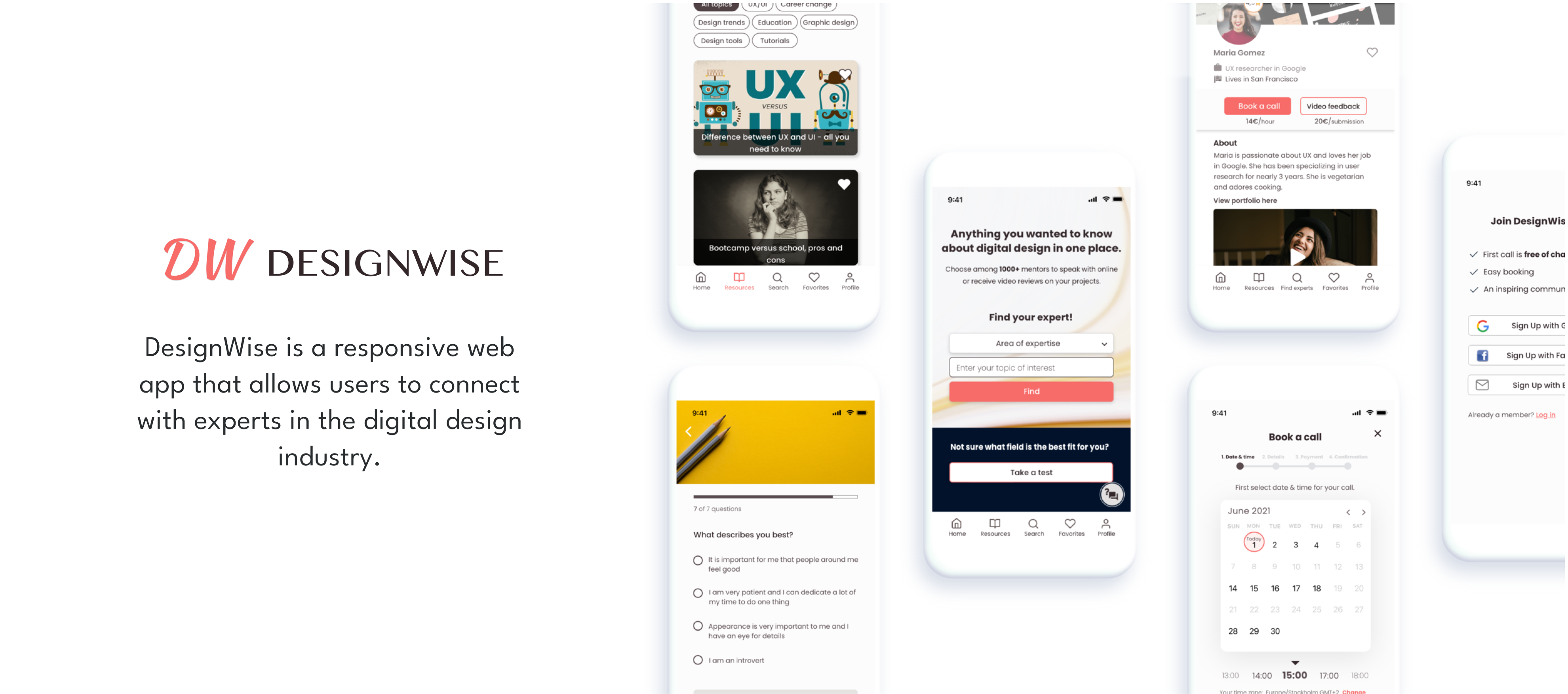
Users who are looking for a career change and are interested in the digital design industry need a way to communicate with a trusted expert to learn more about the industry, as the borders between roles can be blurry in this field and it is challenging to navigate on their own when searching for structured information.
School project for CareerFoundry
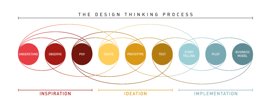
To create DesignWise, I applied the design thinking process, which helped me thoroughly investigate the current problem and find a solution while keeping the user always in focus.
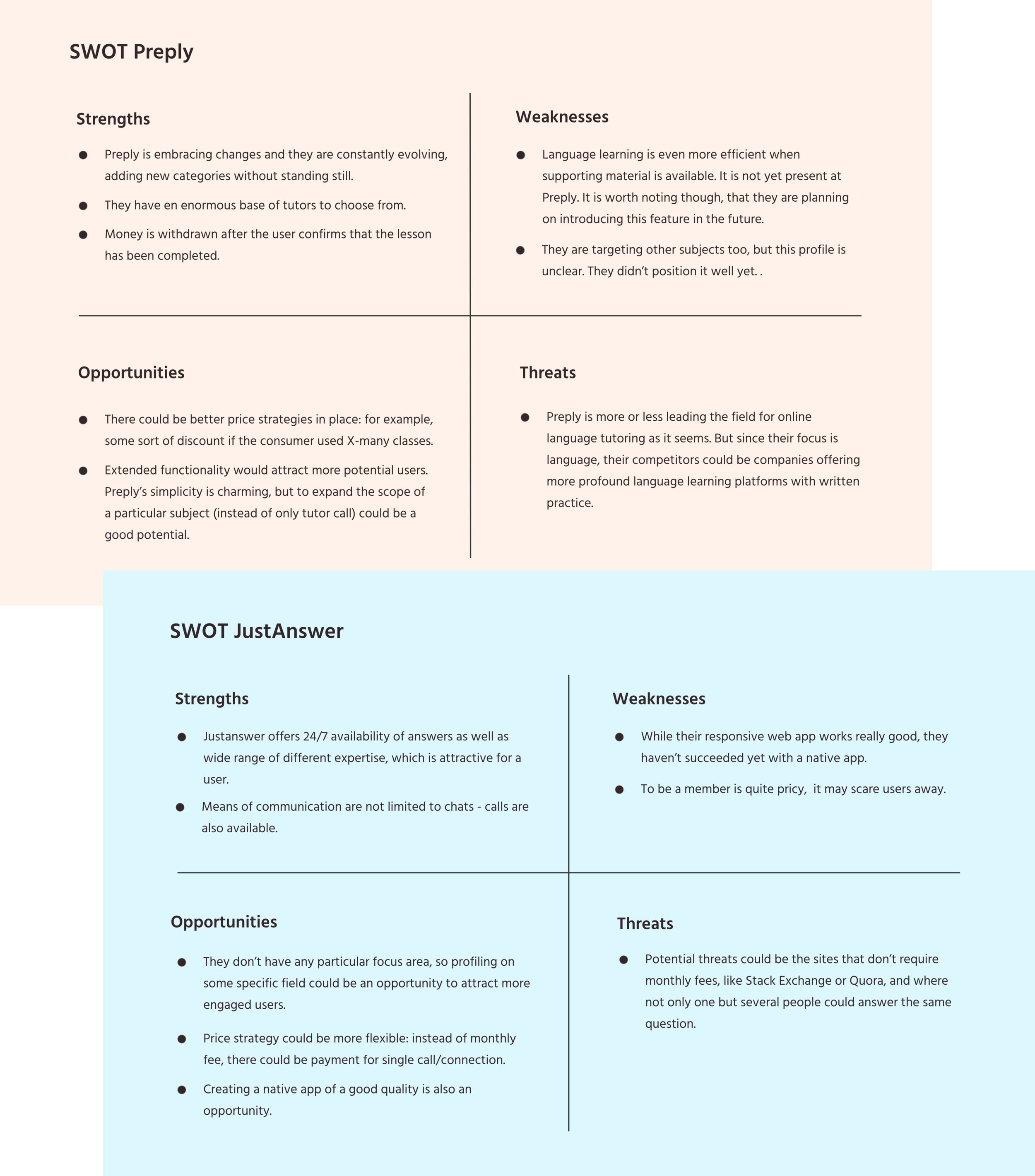
After having studied multiple apps with similar functionality, I settled on Preply and JustAnswer and performed SWOT analysis to gain some insights into the competitors’ work.
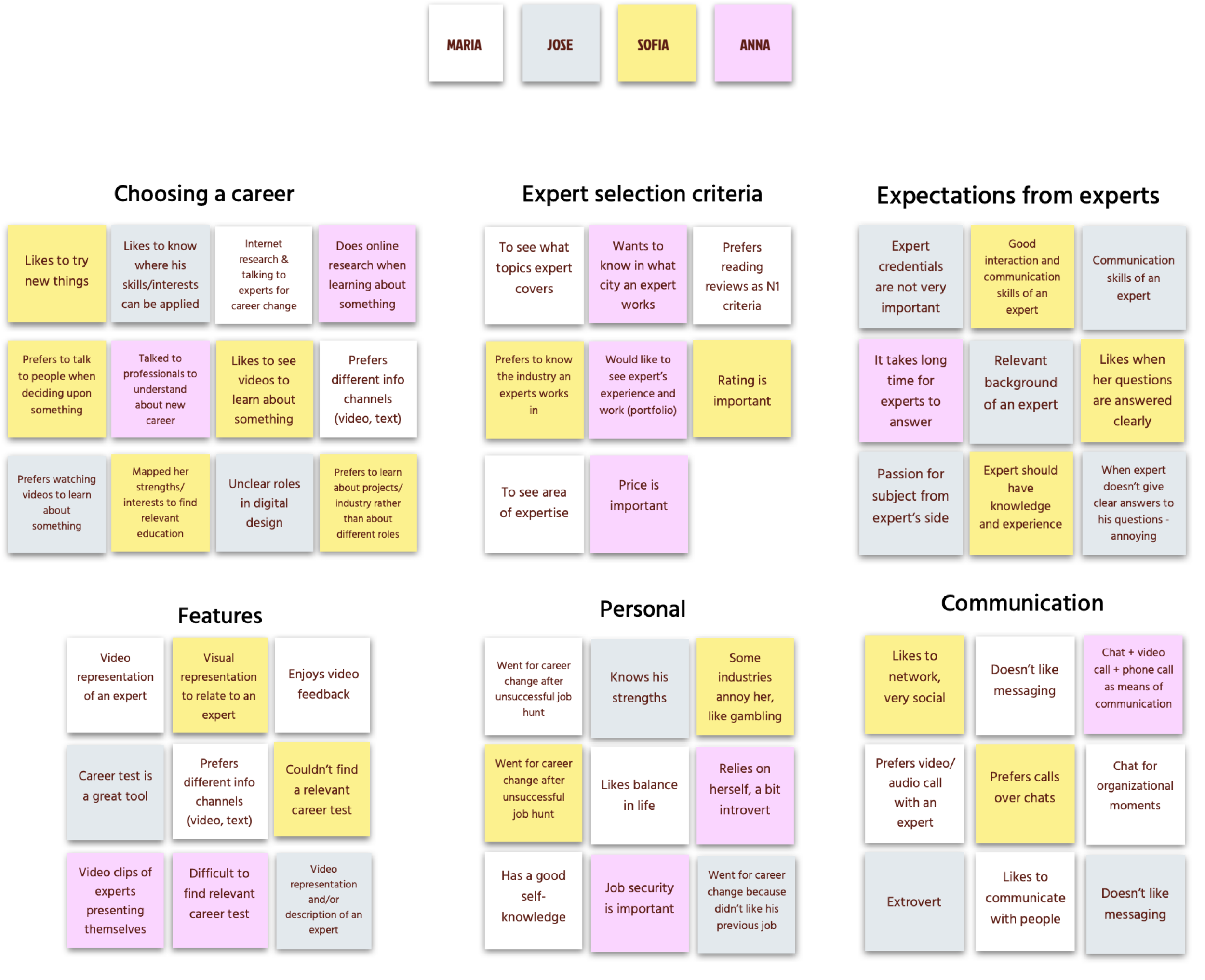
I reached out to 4 people to conduct user interviews, after which I analyzed data using affinity mapping. This resulted in some valuable insights that I later implemented in DesignWise.
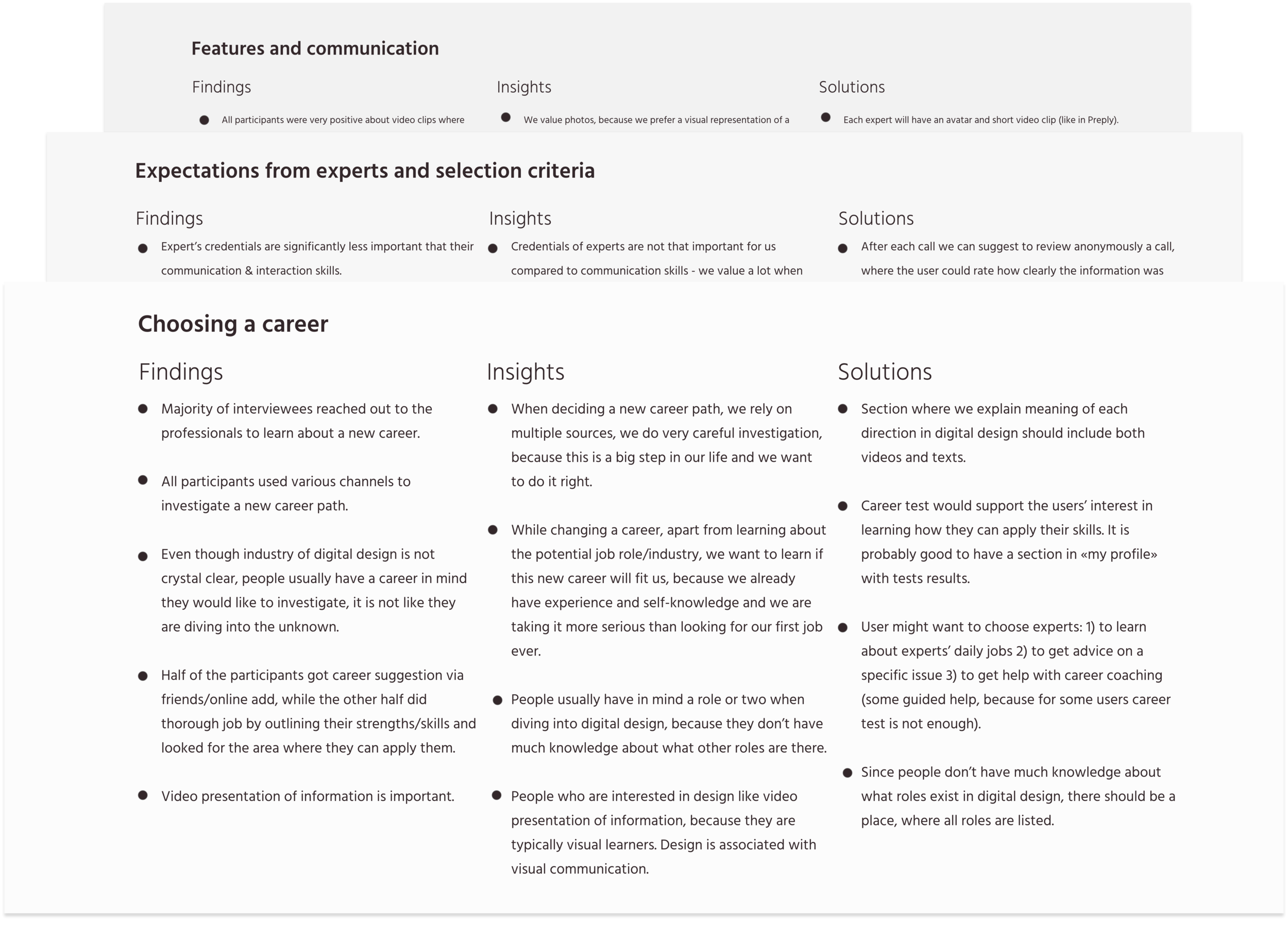
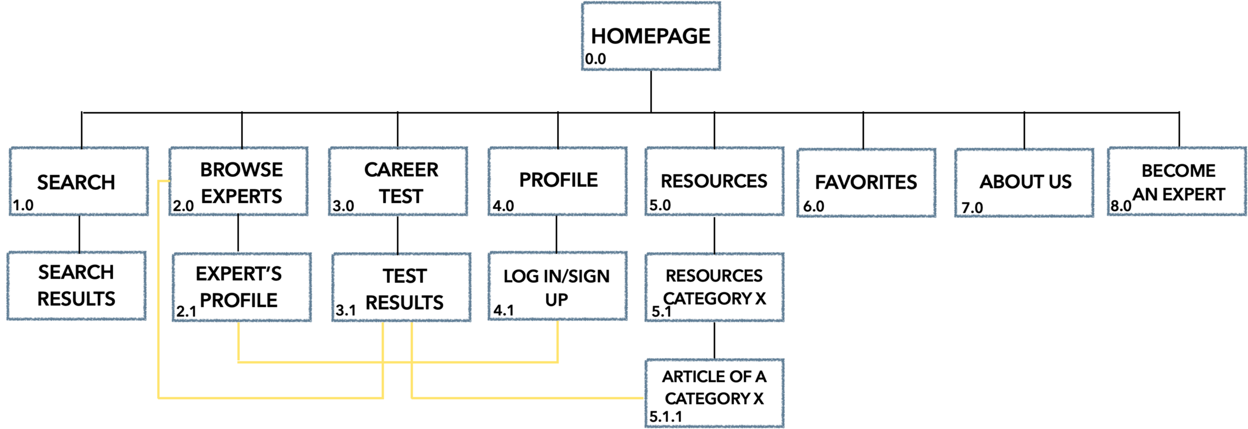
User interviews, user flows and card sorting helped me create a sitemap for DesignWise.
After the prototyping was complete I conducted moderated remote and in-person usability testing with 6 participants. The goal of this study was to assess the learnability for new users interacting with DesignWise for the first time. I planned to observe and measure if users understand the app, its value, and how to complete core functions of the app, as well as to reveal any usability issues.

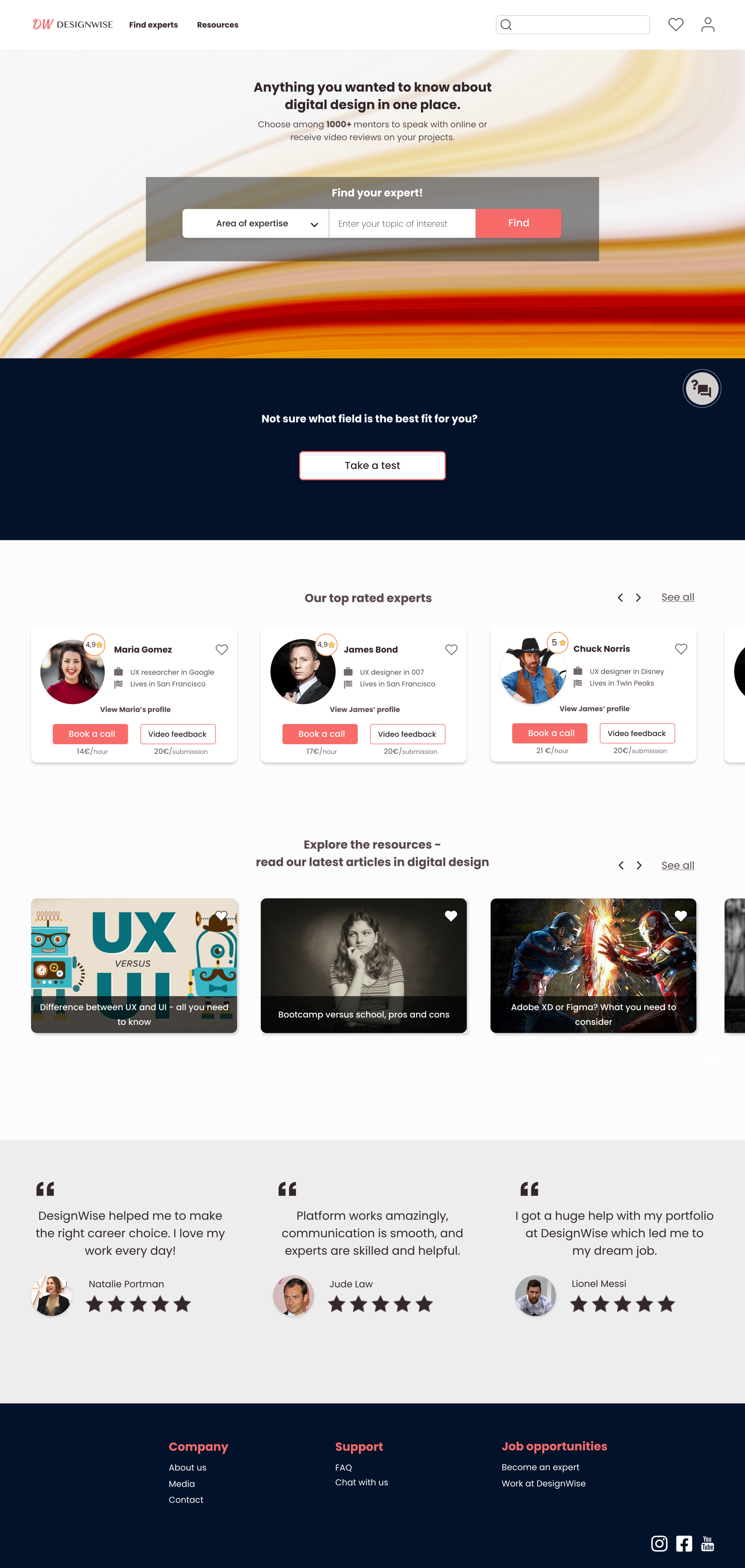
Even though the main focus was on creating and refining the mobile version of the app, I designed a landing page for the desktop.

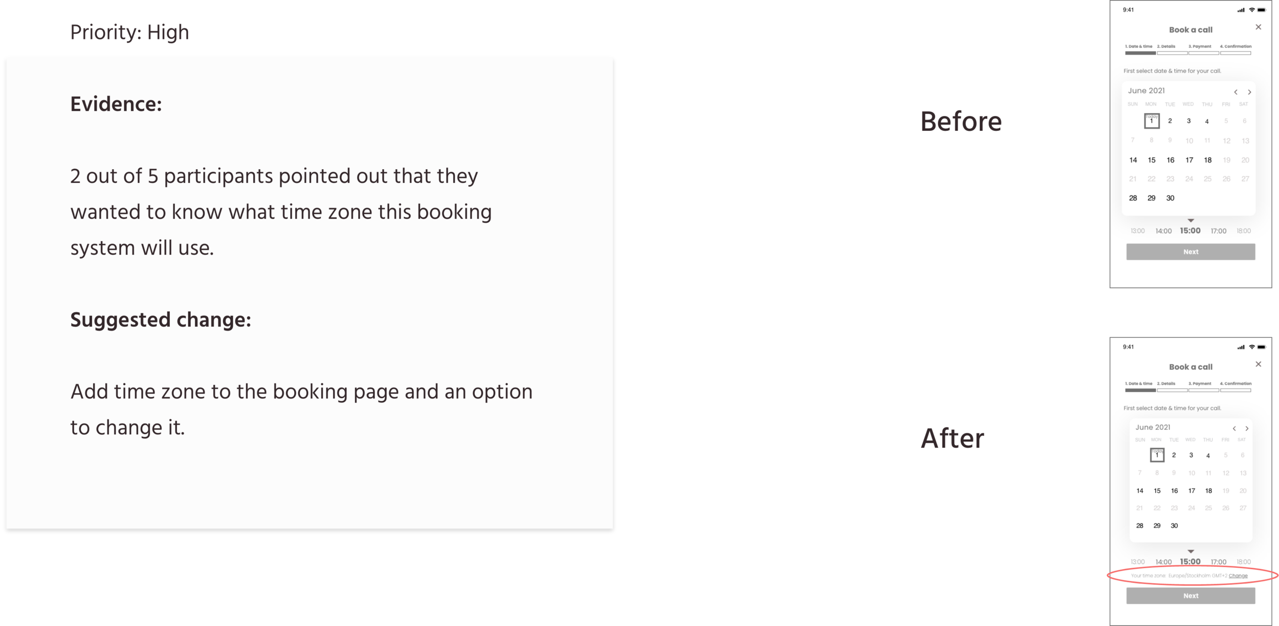
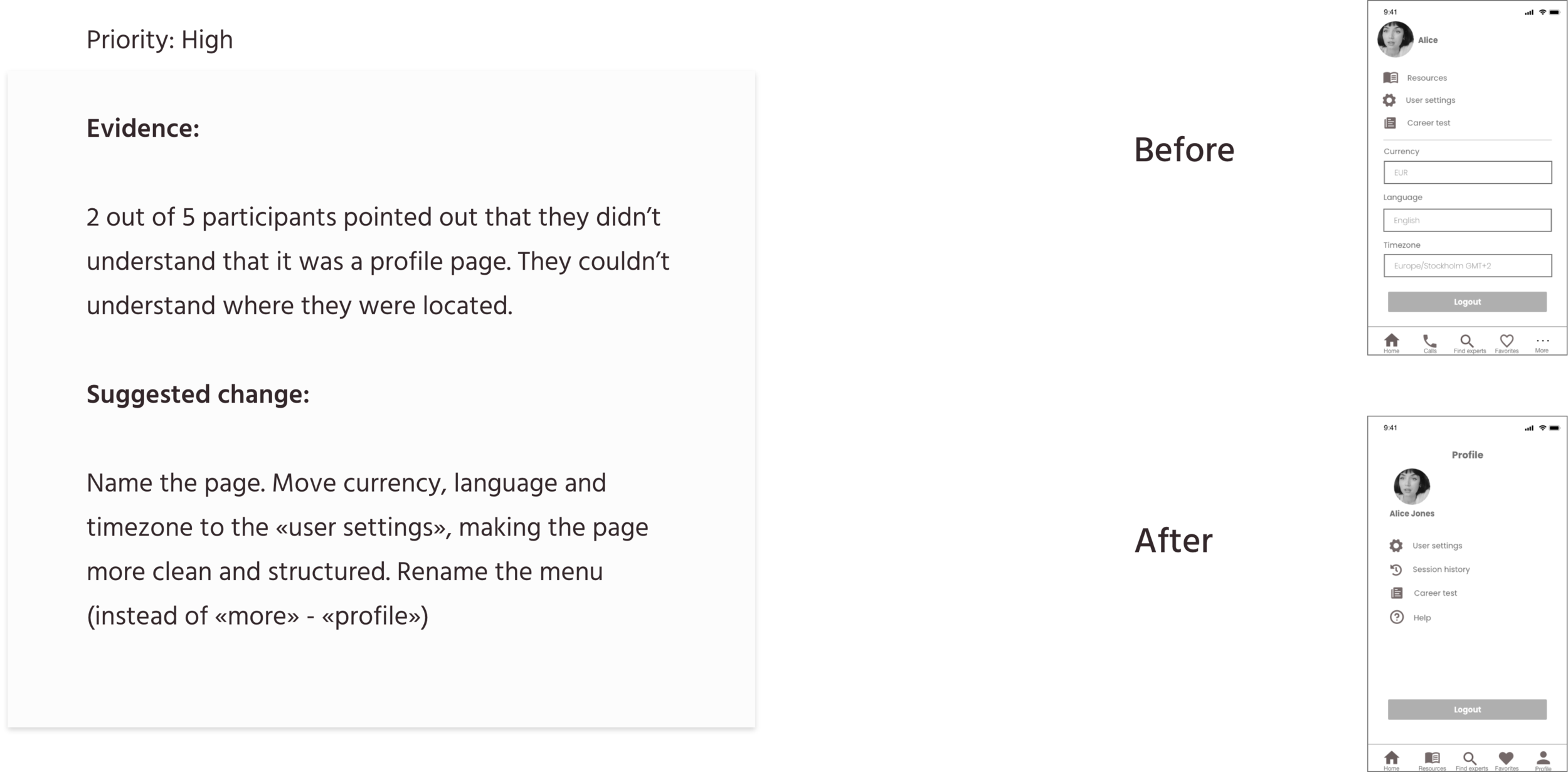
During the course I received a lot of quality feedback, including the one from usability testing, preference test and peers. I iterated constantly, and below there are examples of the most significant changes in the design of the app.
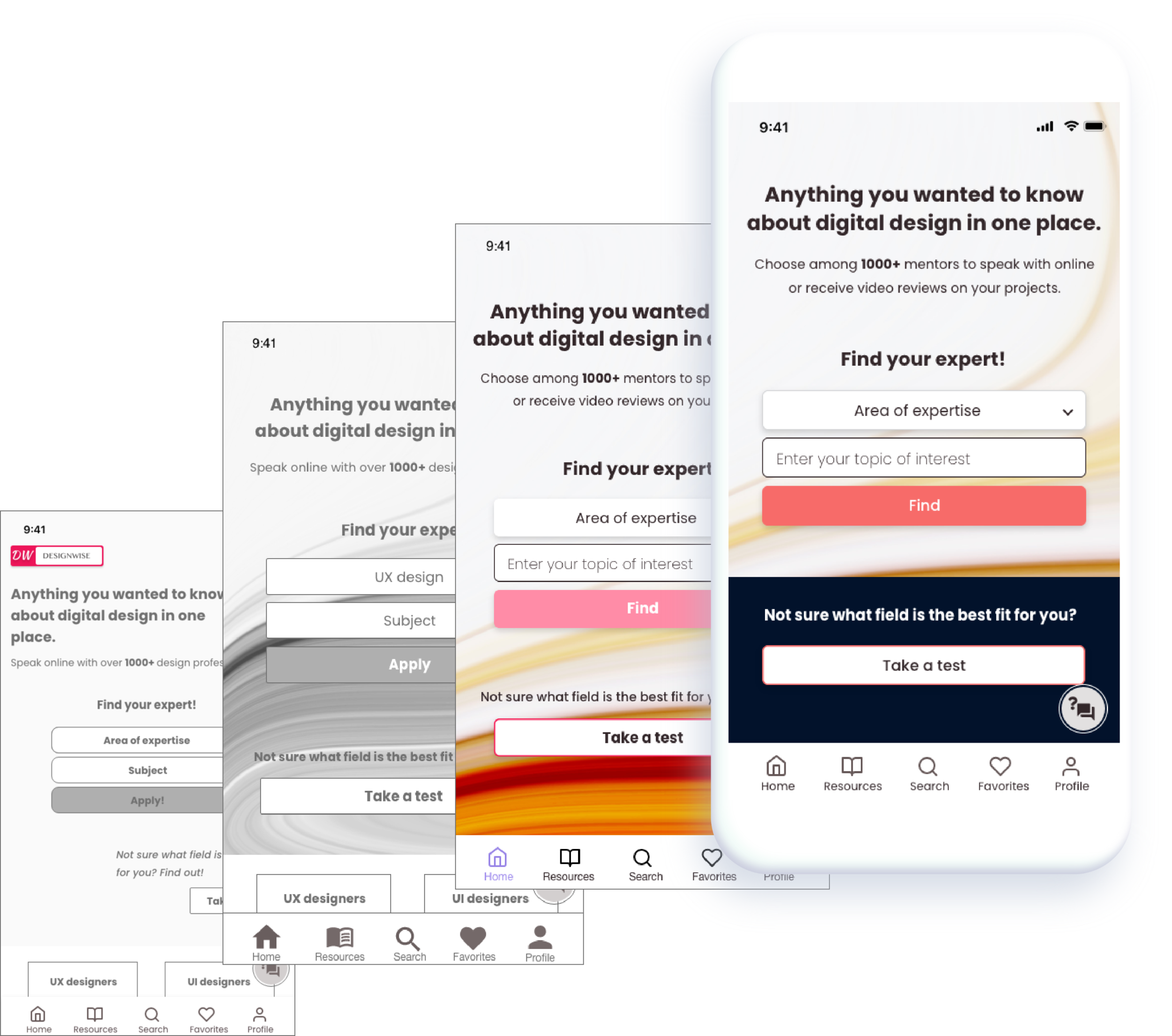
Tagline: Feedback has indicated that the video review option on the expert cards came as a surprise, therefore I decided to mention video reviews in the tagline to familiarize users briefly with this concept.
Tab bar: The current version is more consistent and all icons have the same style, compared to the previous one. It now also includes the selected state.
UI: I used the grid to align the content, unified the design of the buttons and reviewed the color palette which improved the overall aesthetics of the mockups.
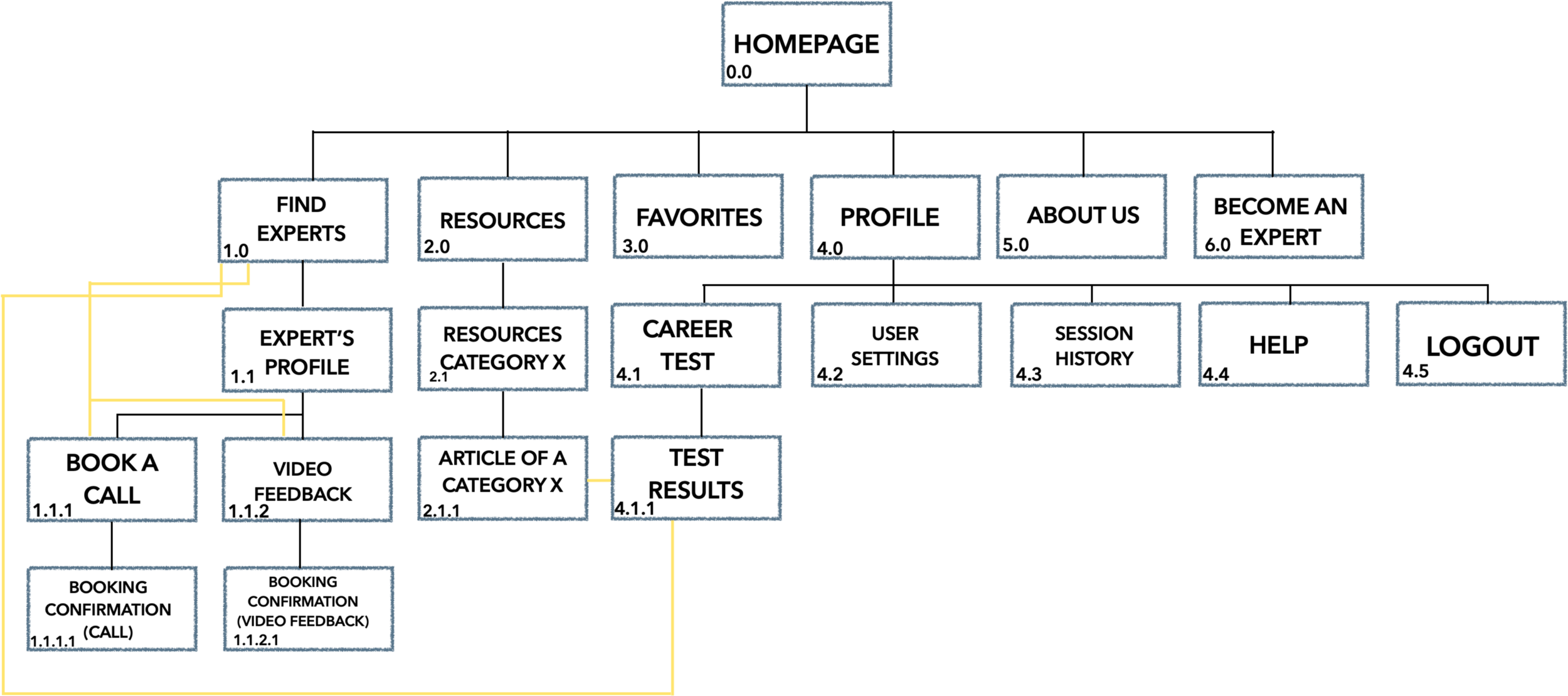
Subject field: As mentioned earlier, usability testing showed issues with the field subject. In the latest version this field ended up having a different label and design, making it clear how to interact with it.
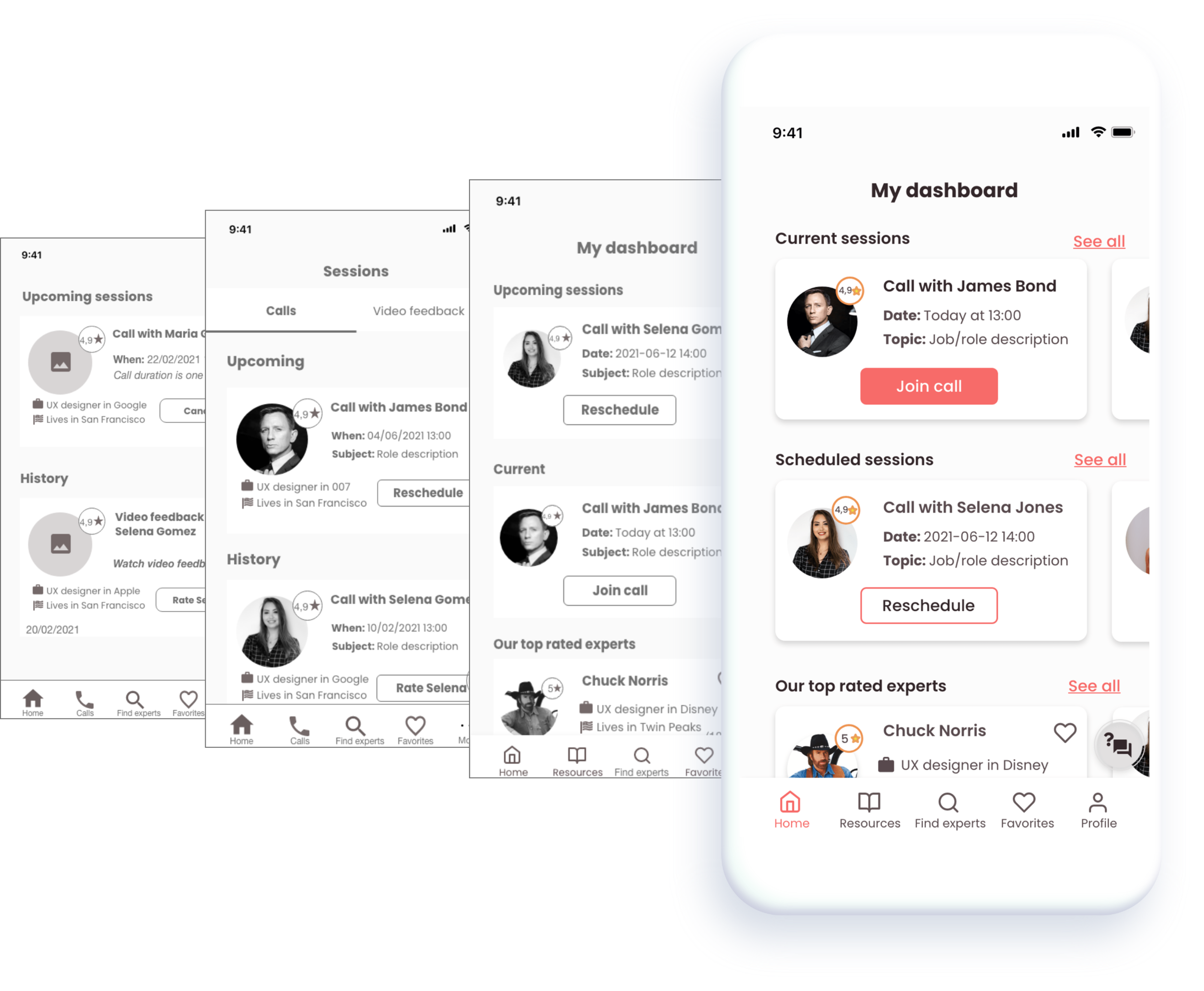
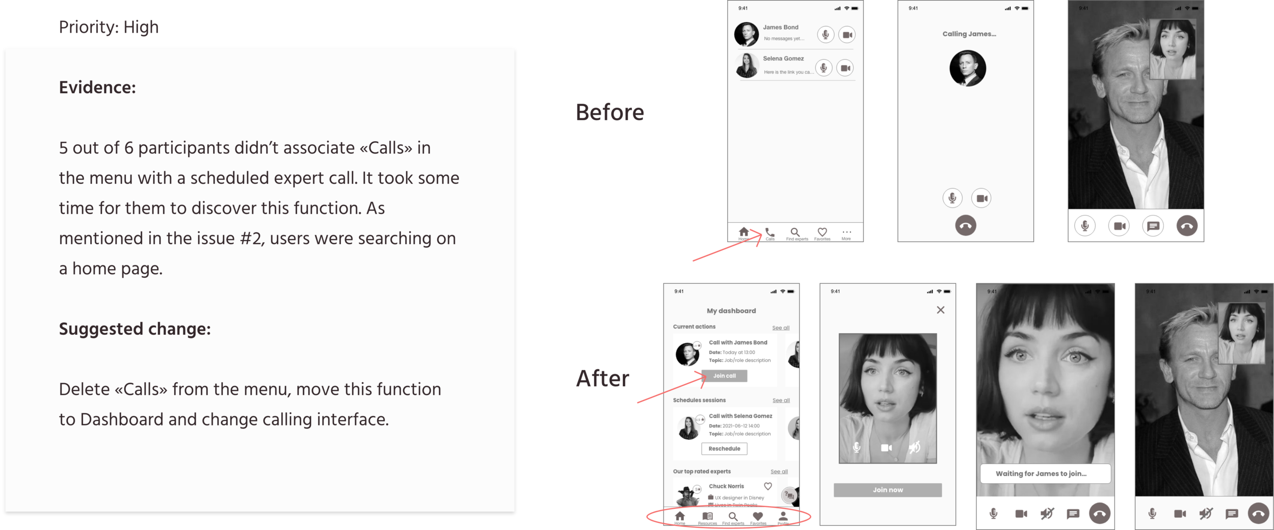
Overall structure: Session history didn’t seem to be relevant on the Dashboard, I moved it to the Profile page. The separate tab with video feedback is now replaced with swiping function, when all options are accessible. Users didn’t seem to understand the overall purpose of the Dashboard as they were expecting call functionality there. I added value to this page by giving an option to join call directly from there and listing top rated experts.
UI: Buttons are now consistent and are clearly divided into primary, secondary and tertiary. Card design has evolved, leaving only important information and functions that are easy to grasp.
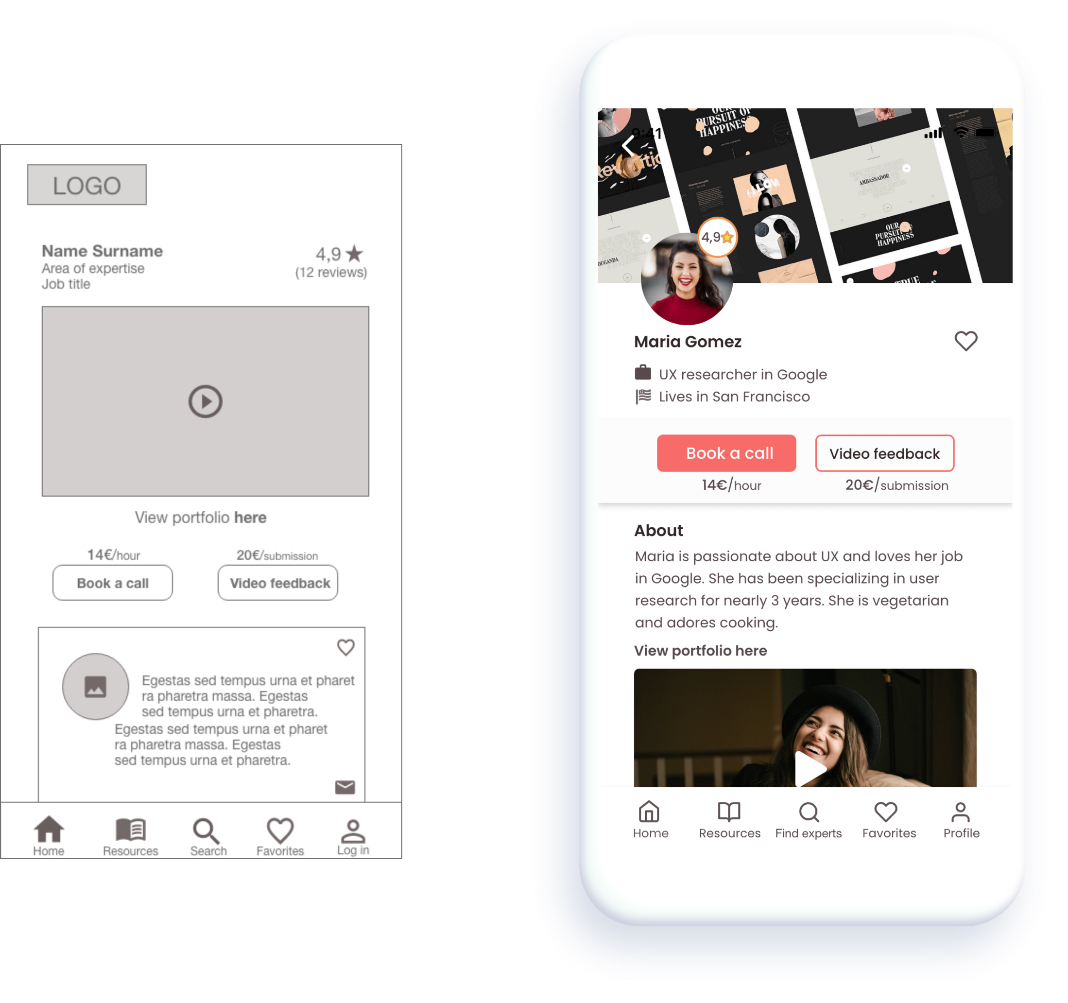
I completely redesigned the expert’s page to bring more important information to front and make this page visually more pleasant and consistent. On the iterated version there is more white space, better alignment, an option to add expert to favorites and better readability.
Keeping the project in order from the start saves a lot of time at the later stages, especially before the hand-off. I had to do a significant clean-up at the end, which could have been avoided if, for example, all dartboards were named correctly and all materials were stored in a structured manner.
Iteration leads to major improvements. I have iterated a great deal throughout the project, listening to the feedback I received from different sources, which enhanced enormously the outlook and functionality of the app. Therefore it is sometimes important to step back from your fixed ideas and accept that changes are needed.
During interviews and usability testing, it is important to allow users to figure things out on their own without trying to intervene and help or guide them, which could lead to biased responses. If the user is stuck, however, it is natural to assist.
It is easy to get carried away during the design process, but it is important to keep the user in mind. There were times when I didn’t come back to my user personas and was creating from my perspective, so I had to remind myself who I am making this app for.