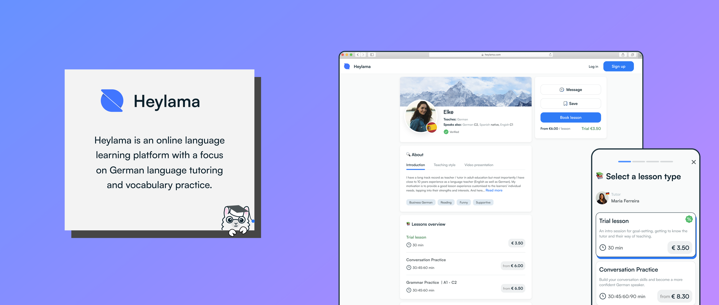
In 3,5 months, I designed an MVP that consisted of login/signup, tutor listing, tutor profiles, booking flows, lesson management, dashboards, and availability for tutors. After the public launch, based on the business and user requirements, I continued to design new features and extend/iterate on existing ones (a total of around 12 features).
The product has rich functionality, but in this presentation, I will focus only on the design process of one feature: tutor discovery (tutor list + tutor profile)
Employer: Heylama
The problem with current online language tutoring platforms is that they have an overwhelming number of tutors, making it difficult for users to find “the one". In addition, the current tutor lists are often impersonal and don't offer effective matchmaking.
We need to provide a solution that helps students find their perfect tutor more effectively. If we disclose more information about tutors' personalities and teaching styles before the actual lesson, students can quickly determine if the chemistry is right, improving the matchmaking process and increasing user satisfaction and retention.
I began by exploring all the language tutoring platforms I could find, and then narrowed my focus to Preply and iTalki. I analyzed these websites from the perspective of how they match students with tutors, taking notes on content, navigation, usability and aesthetics. Once I completed a thorough audit, I presented my findings to the team, and we discussed how to utilize them. Below is a small excerpt of the results.
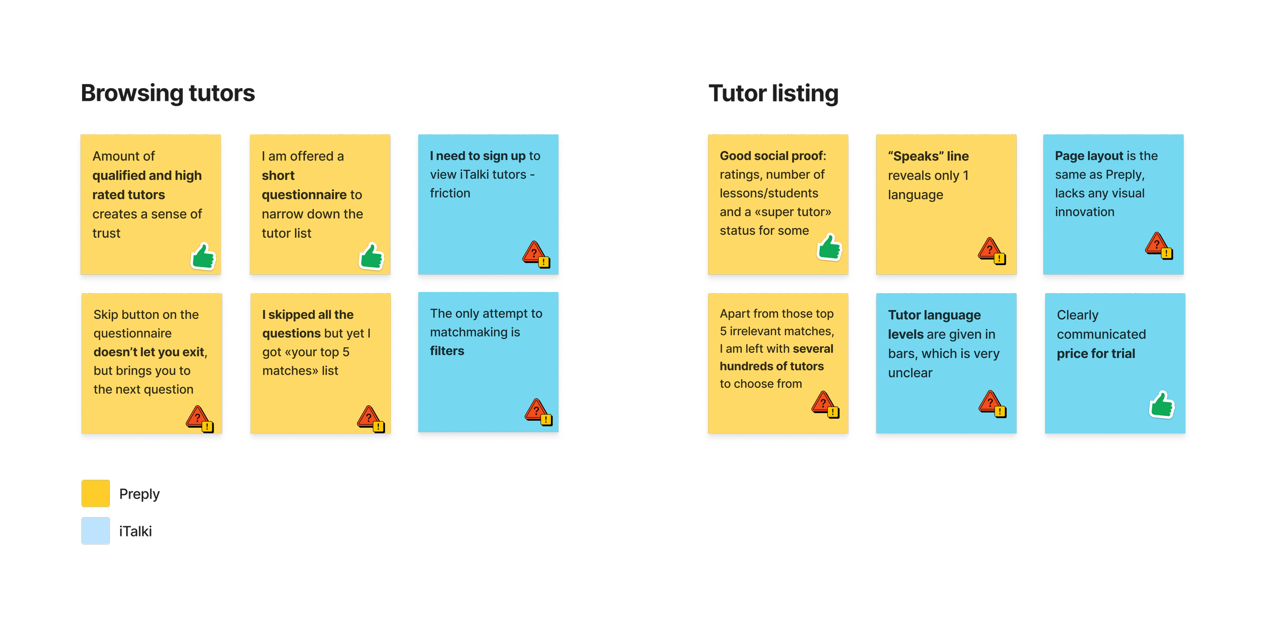

In general, it doesn't seem like these companies put a lot of effort into personalizing tutor-student matchmaking. They both rely on a generic filtering system and trial lesson options (which is a valid base, though). Preply recently introduced a questionnaire, but its user experience is far from optimal yet. It's possible that with a user base as large as theirs, there are no strong incentives to optimize tutor discovery. It's also possible however that their users find their current models sufficient.
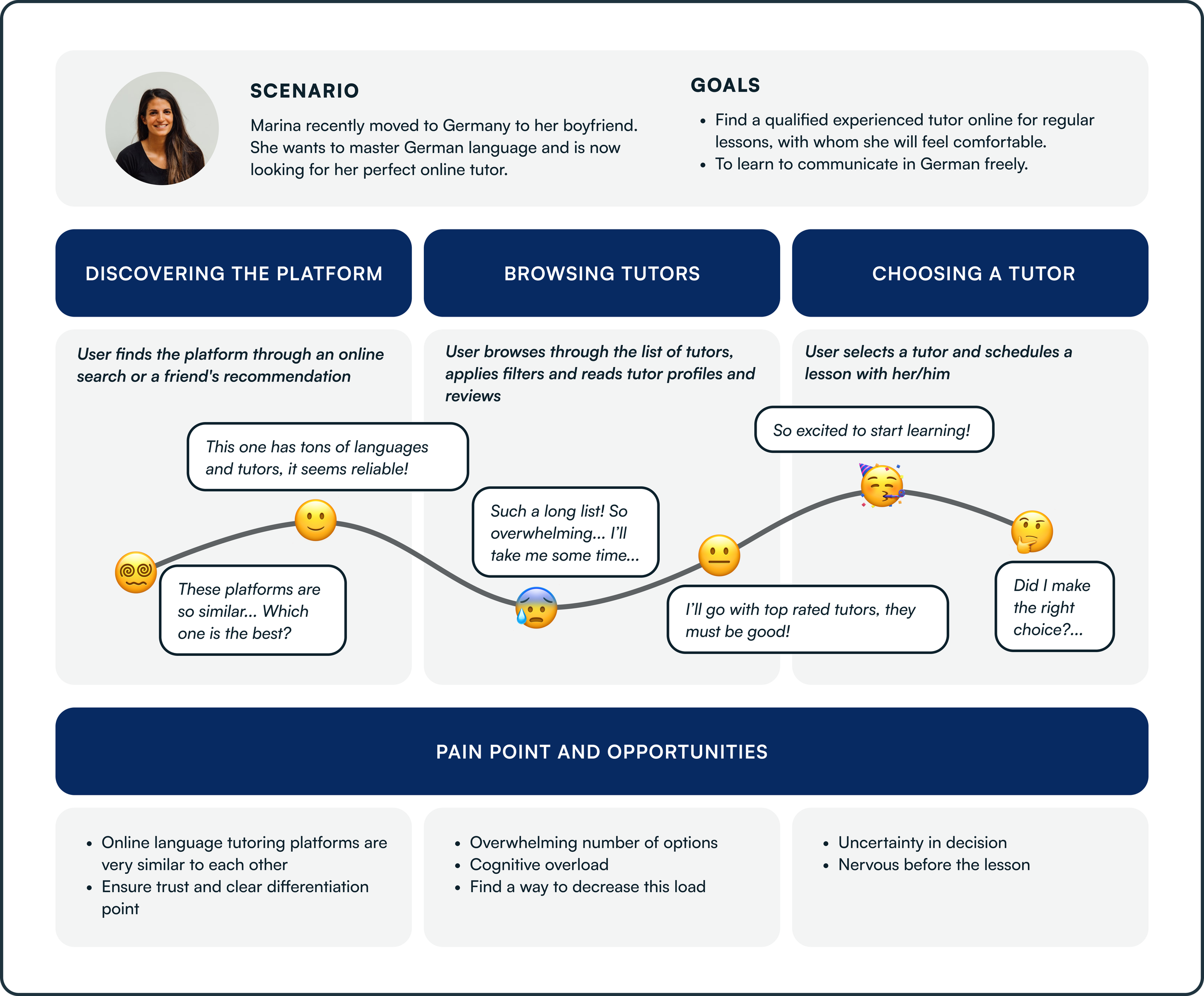
After conducting UX analysis, I prepared a user journey map based on the platforms I was researching. It served as a visualization of the general online tutor search flow and provided me with some ideas.
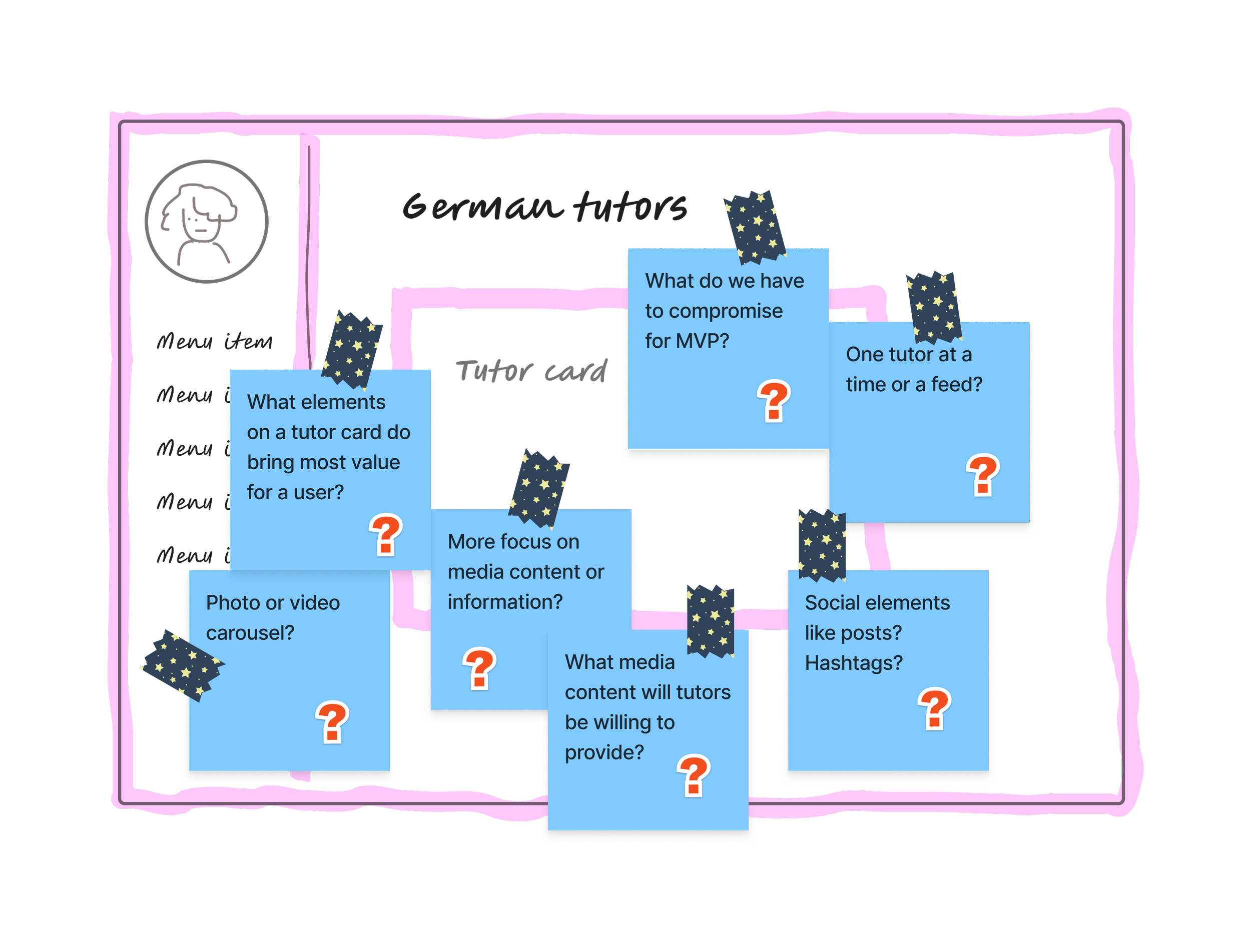
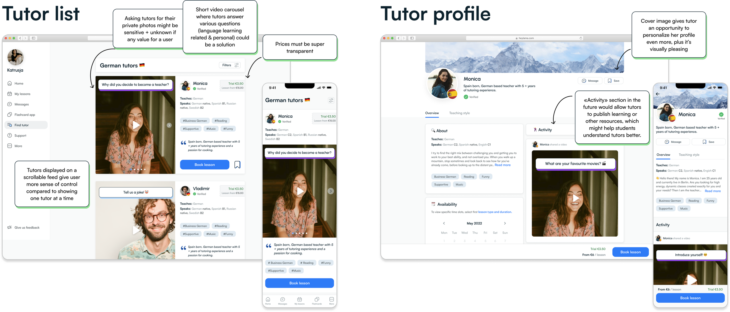
Once we defined the problem statement and constraints of the MVP, it was time to start brainstorming ideas. There were many choices to make and things to consider, but in the end, we settled on a video questionnaire that tutors would record for their profiles. We hypothesized that this would give students a much better idea about the potential tutor and therefore enhance matchmaking.
Before jumping into creating wireframes, I established a visual style for the product and created a style guide. After that, I began experimenting with different layouts for the tutor list and tutor profile. After several rounds of iteration, based on feedback from the team and brief user tests, I delivered hi-fi screens for the MVP.
I have conducted six moderated usability tests, five of which were conducted online and one in person. All participants were language learners; however, I could not achieve better age diversity as the age range of volunteers was limited to 25-35 years old.
The main goal of this test was to observe how users would interact with Heylama to achieve their goal - to find the right tutor for their needs. I wanted to evaluate the overall experience from the moment of opening the platform to the moment of deciding upon which tutor to book.
I provided participants with the following scenario:
“You have a goal to master German language and you are scouting for a good online tutor. Your friend recommended Heylama to you. You want to check it out and find a tutor you like with whom you would be ready to book a lesson”.
I summarized the results in a spreadsheet to get an overview of all uncovered issues and in the presentation with categories breakdown, user quotes, and visual examples.
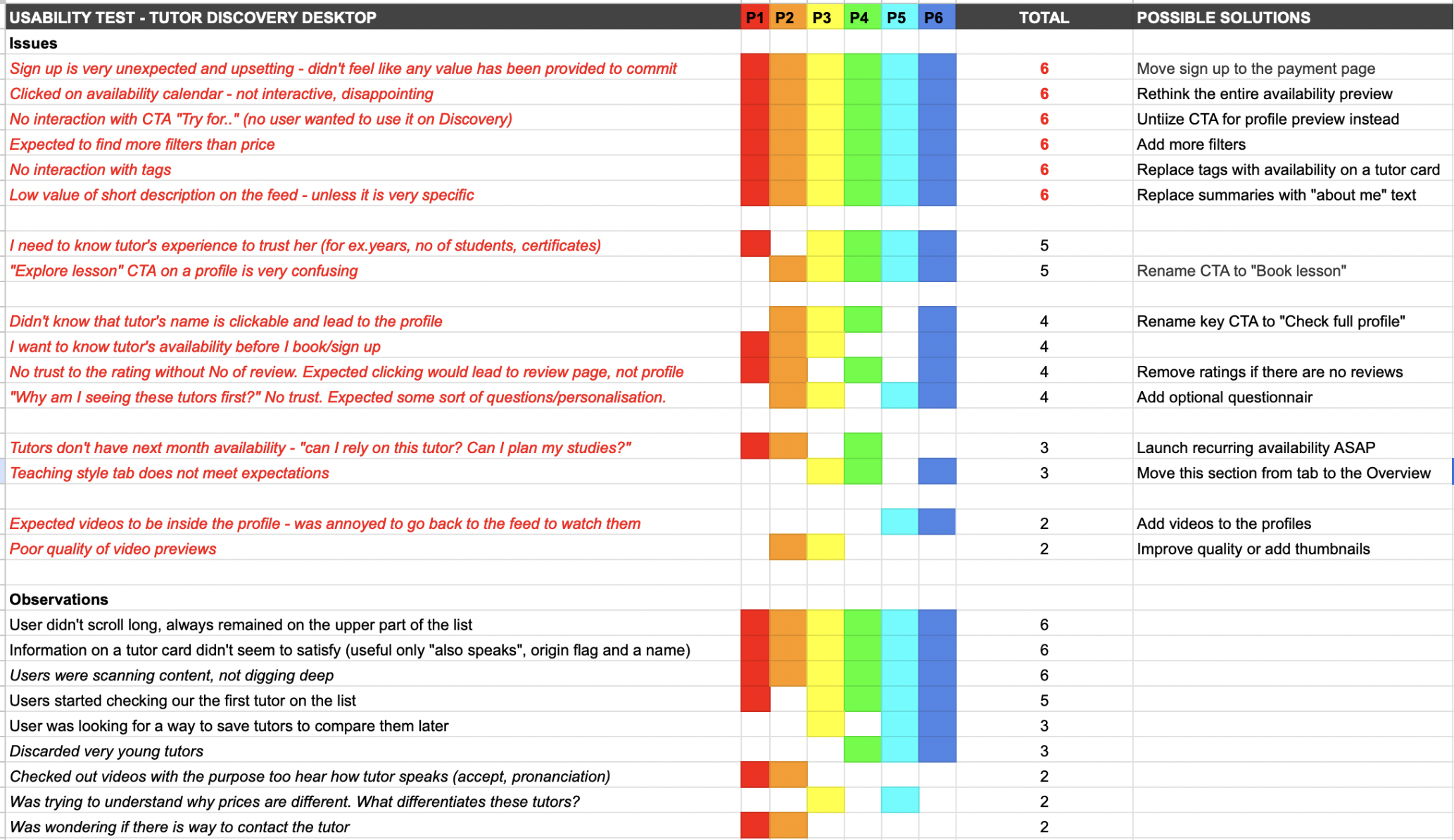
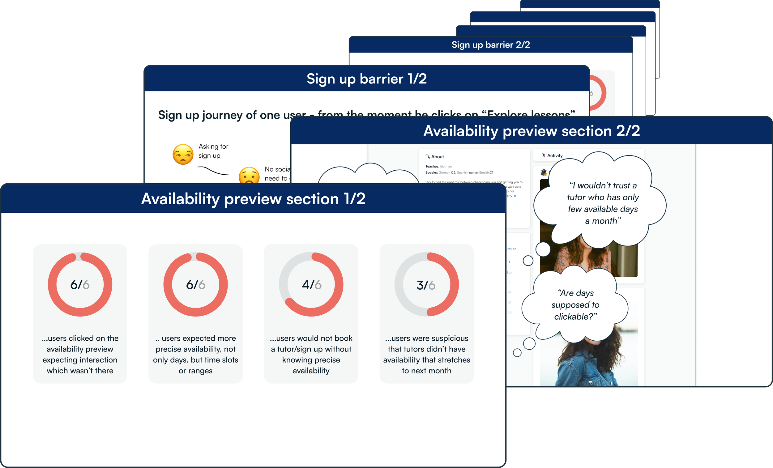
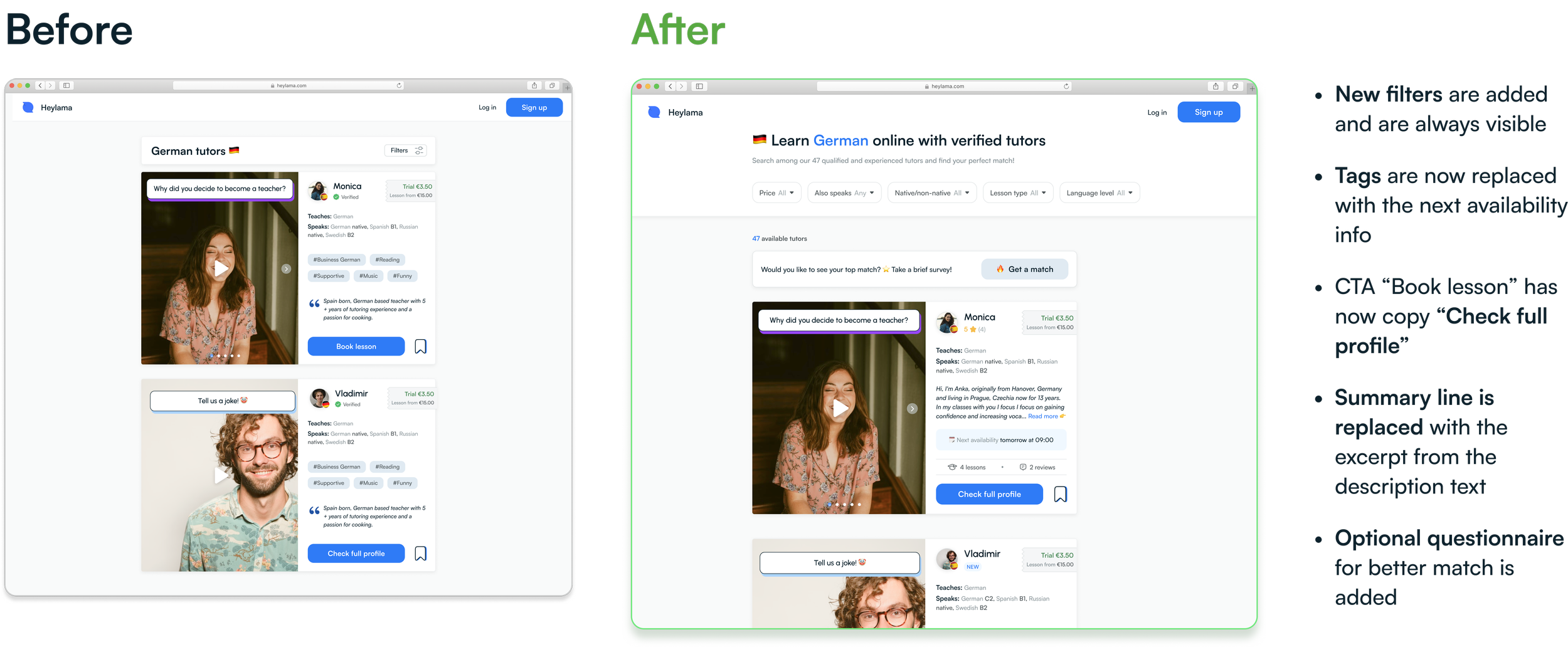
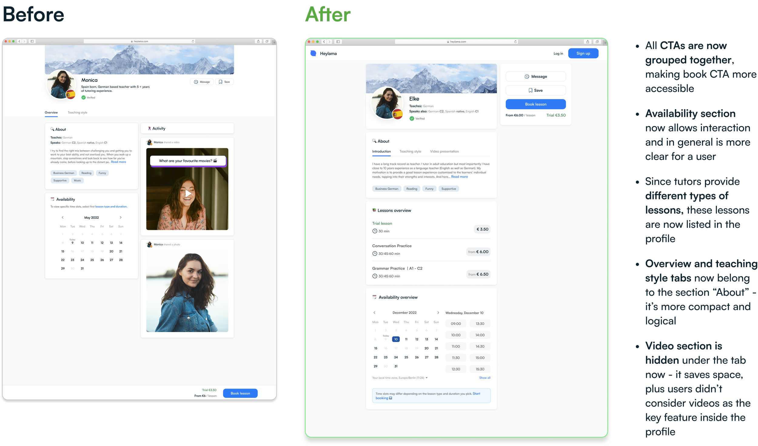
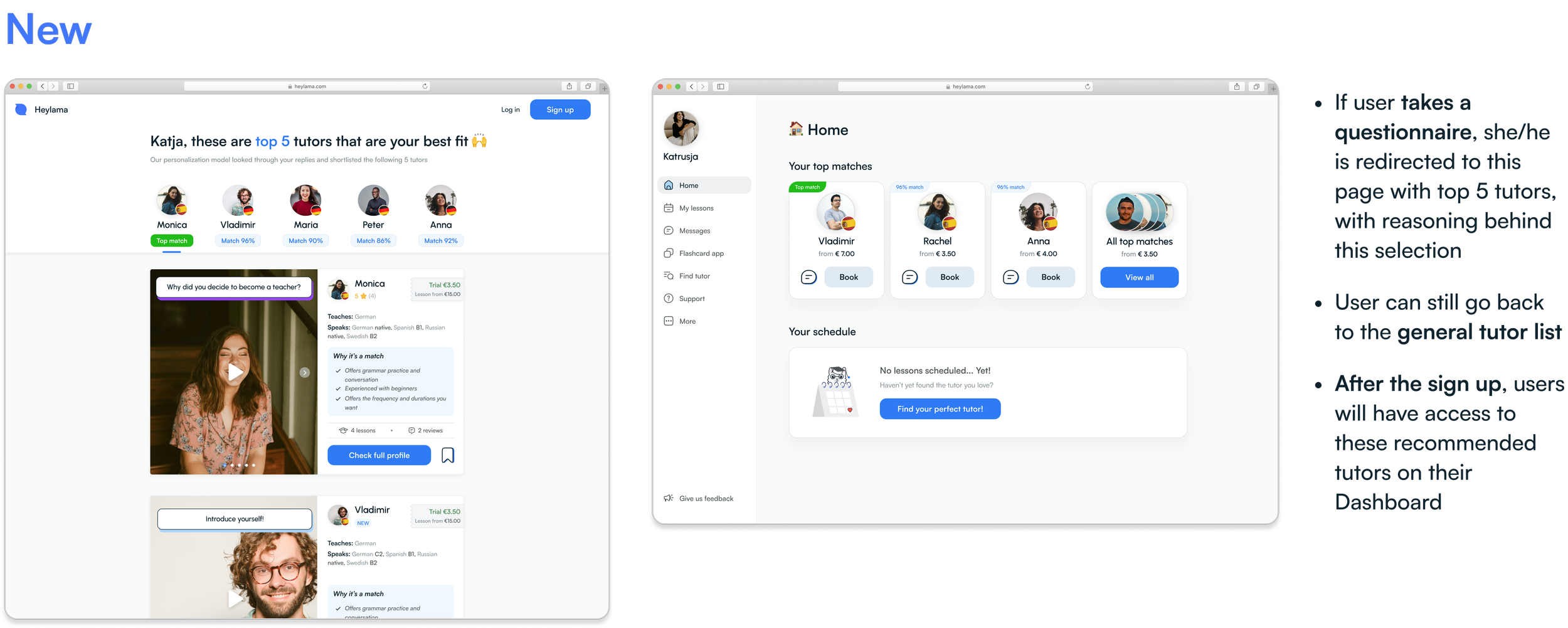
Based on the test results, we gradually began to improve the tutor discovery process by iterating on existing elements and introducing a new feature - an optional questionnaire that helps students narrow down their tutor search.
In an early-stage startup and a small team, the cycle between design handoff and actual implementation is very short, which is rewarding and motivating. Any required changes can be implemented almost instantly (if priorities are set reasonably). Another enjoyable experience is being involved in the majority of product decisions and having the option to advocate for user needs.
On the other hand, the speed of work and experimental nature of the product doesn't allow for dwelling on feature improvements. Being a perfectionist, I still didn't want to sacrifice quality over quantity, which often resulted in significant work overtime. As time went by, I learned to be more efficient and let things go. You can't excel at everything!