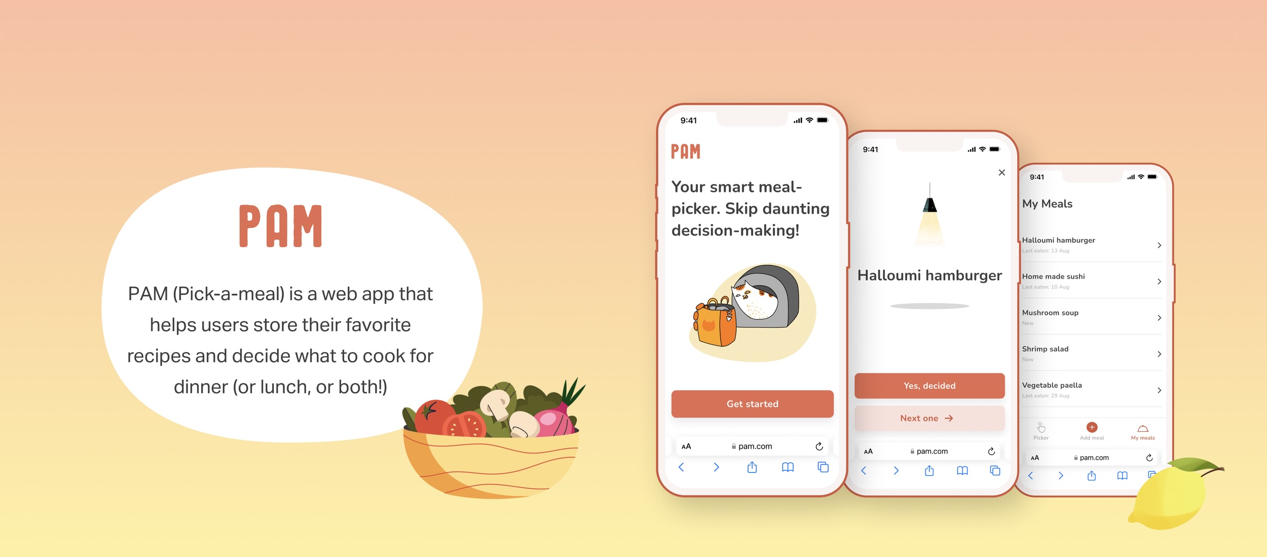
Users, who often cook at home, spend time not only on cooking itself but also on deciding what needs to be cooked. In addition, very often favorite recipes are spread out across different platforms and it takes time to look for them.
A solution for this problem would be building a simple food picker that stores recipes and suggests meal options based on when the user last cooked each meal.
Self-initiated project
The project was planned as a small and useful tool for my own household and friends. My developer friend agreed to work on the implementation, plus I was eager to start practicing my front-end coding skills (this case study does not contain the code, yet!)
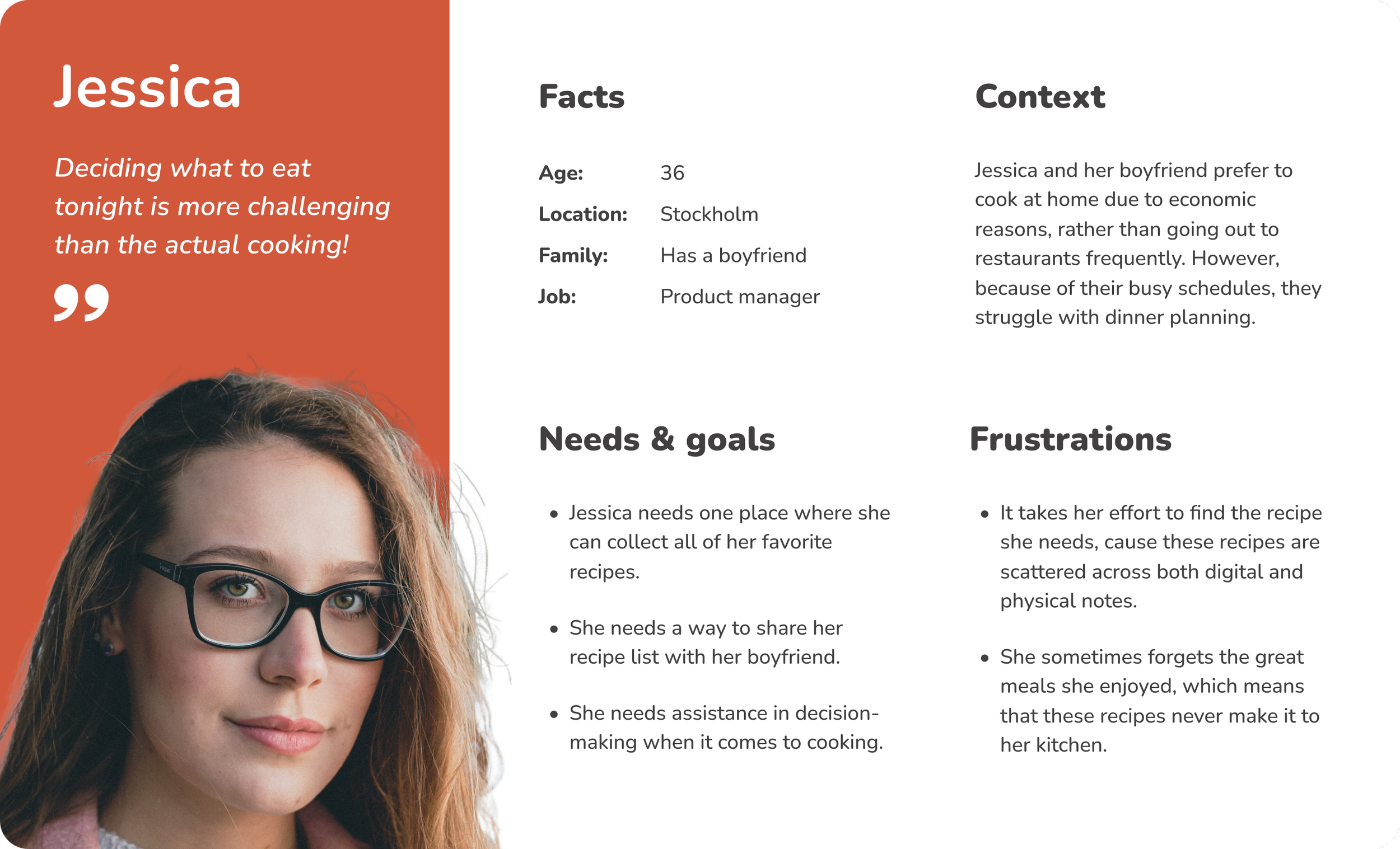
The design process was pretty standard but simplified. I scouted similar apps and analyzed them for pain points and inspiration. Based on informal talks with my friends, I visualized the user persona and got an idea about the product features. Then, I quickly sketched the first wireframes in Figma and settled on the visual style. After usability tests, I refined the designs, and there it is, ready to see the world!
I had two rounds of usability testing: the first one was in-person with two of my friends, and the second was non-moderated via Maze with nine participants from my network.
I obtained the most valuable data during the in-person interviews and iterated based on their feedback. However, I wanted to test even the updated version, so I chose to use Maze. The reason for using Maze was that it allowed me to get feedback without scheduling formal interviews. This was especially useful as I was very busy at the time.
The goal of this test was to identify any usability issues in the main user flows, with a particular focus on how users perceive the current navigation style. The following tasks were given to participants:
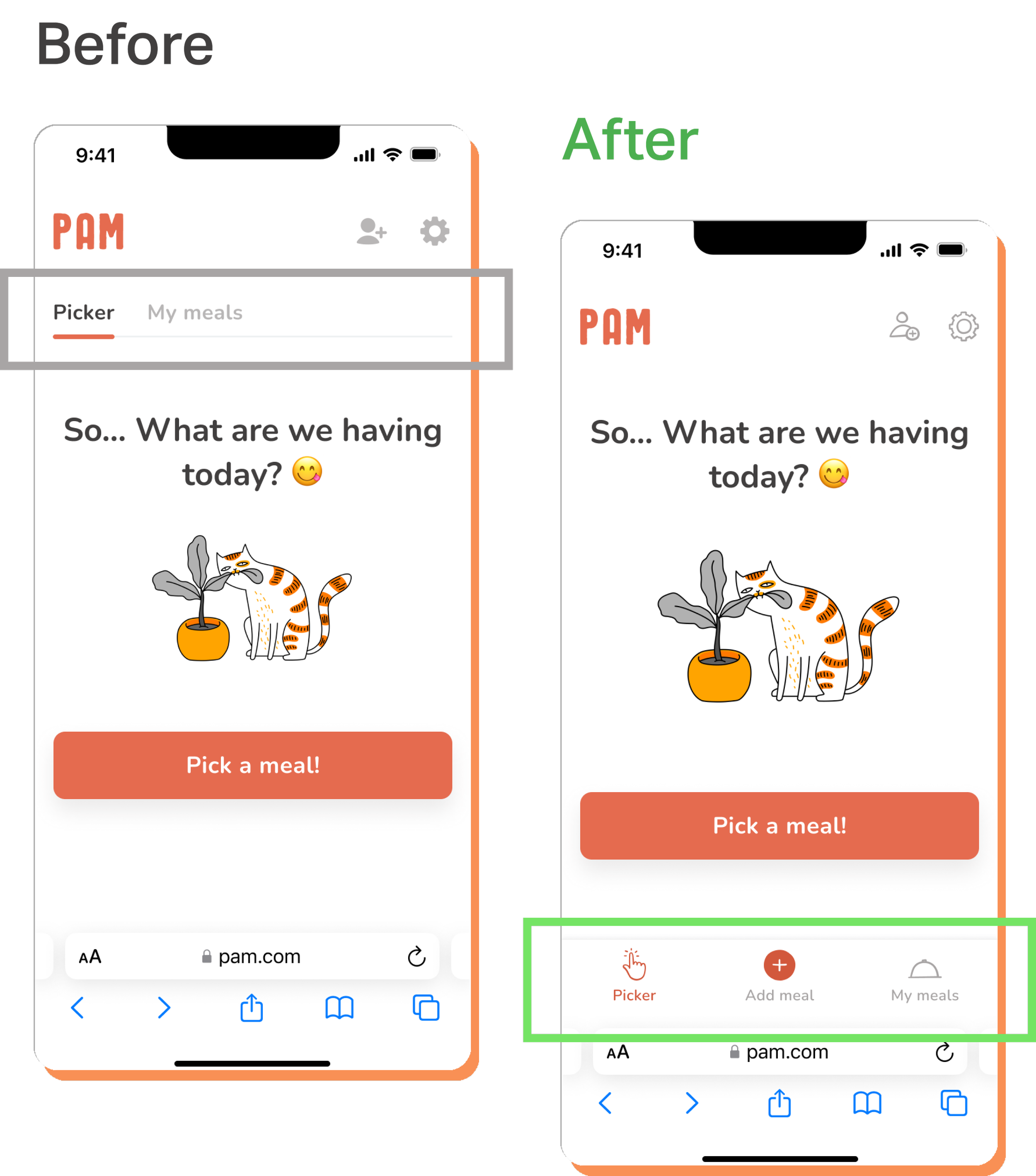
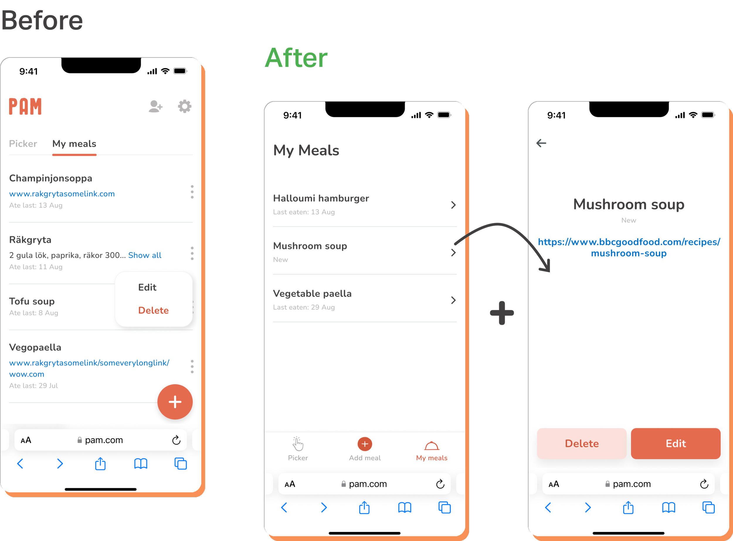
After observing a user during an interview, I found that the original tab-based navigation was not optimal for mobile accessibility. As a result, I decided to switch to a bottom navigation, which is easier for fingers to use.
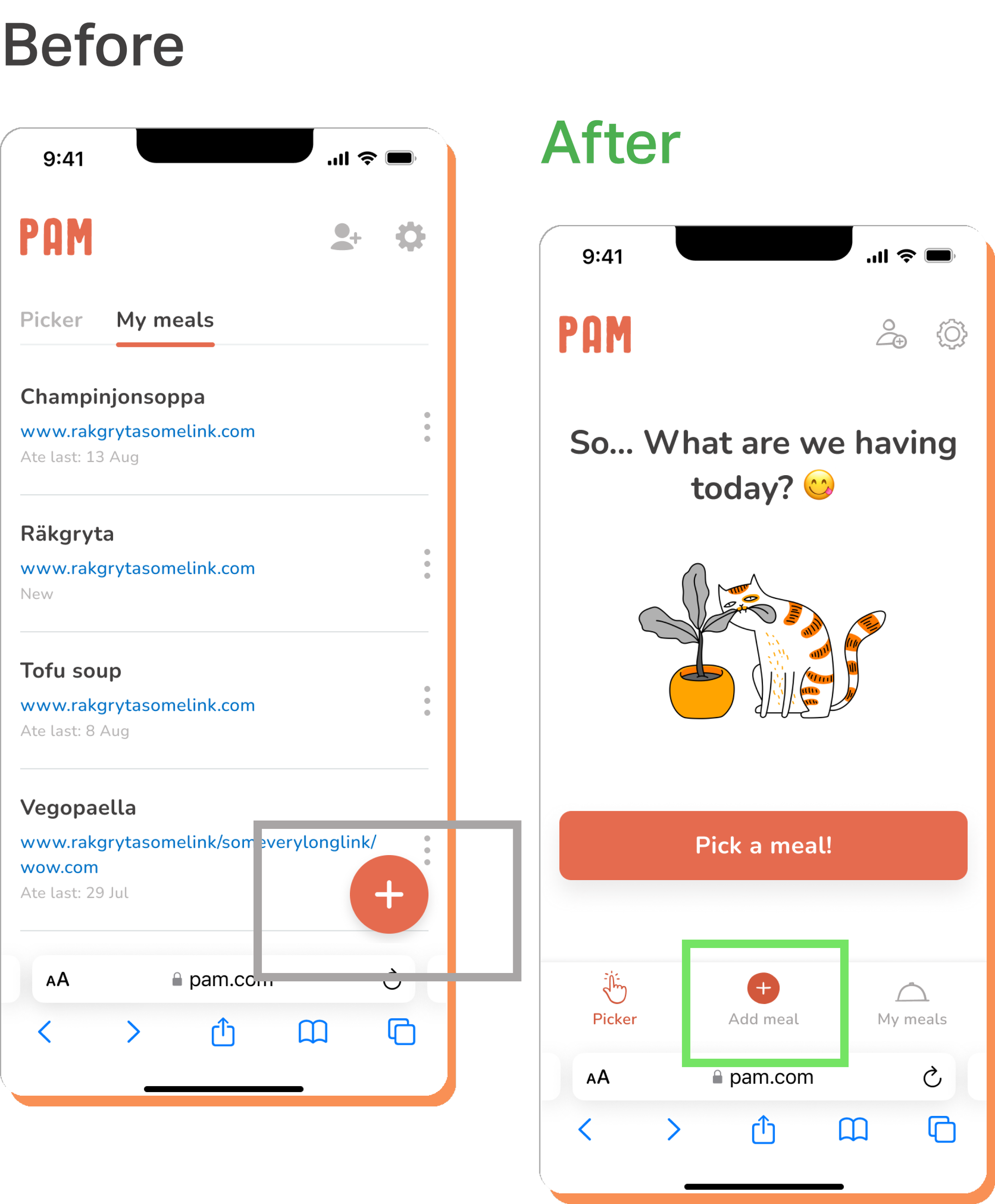
Users were able to locate the add button for meals, but they were initially looking for it on the main page. This made me realize that adding a meal is a distinct feature that deserves a shorter route, therefore I added it to the navigation bar.
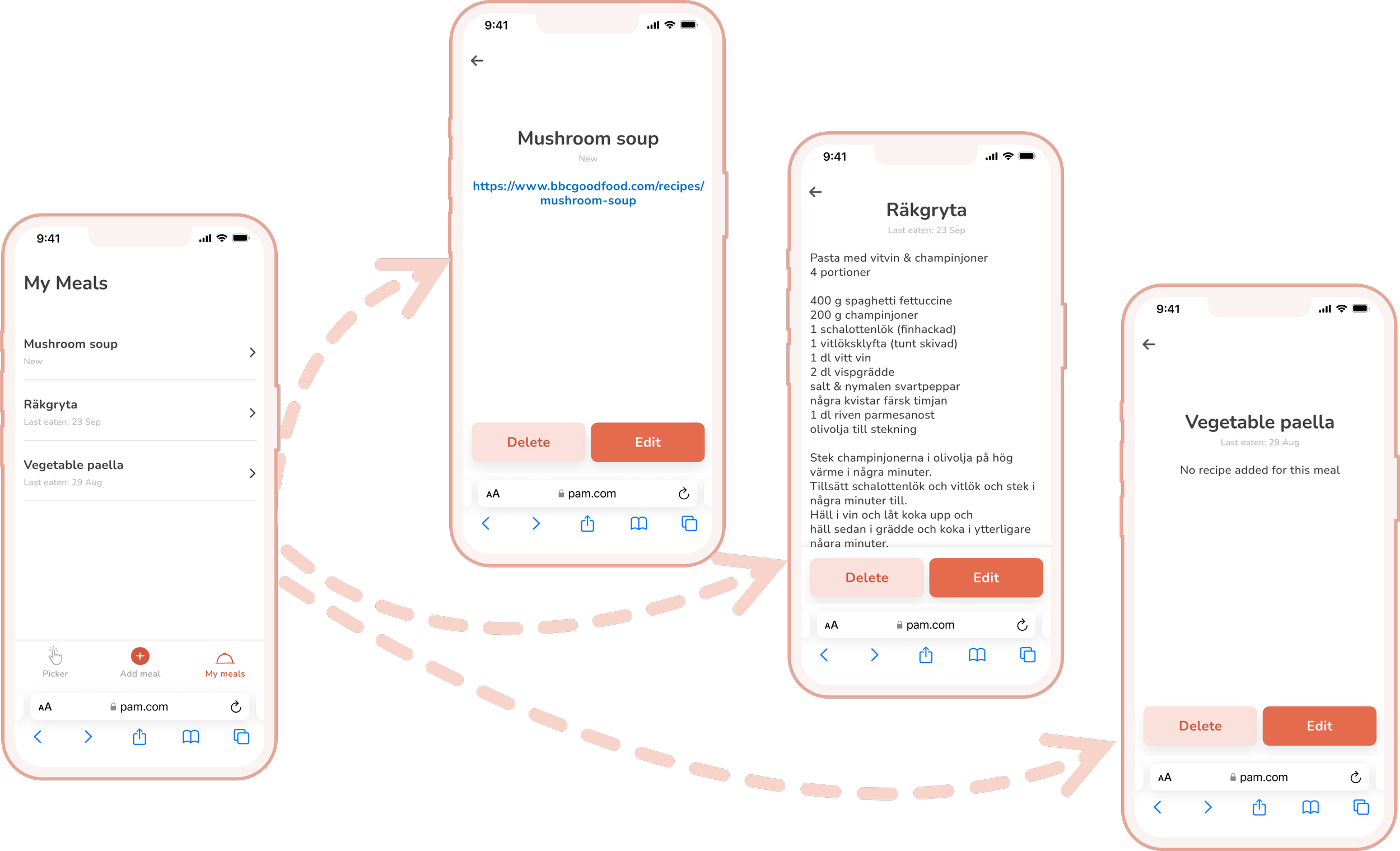
Initially, I designed a single list that included names, recipes, and edit options. However, users often clicked on items in the list expecting to be taken to the recipe page with the edit/delete CTAs. I made the necessary adjustments.
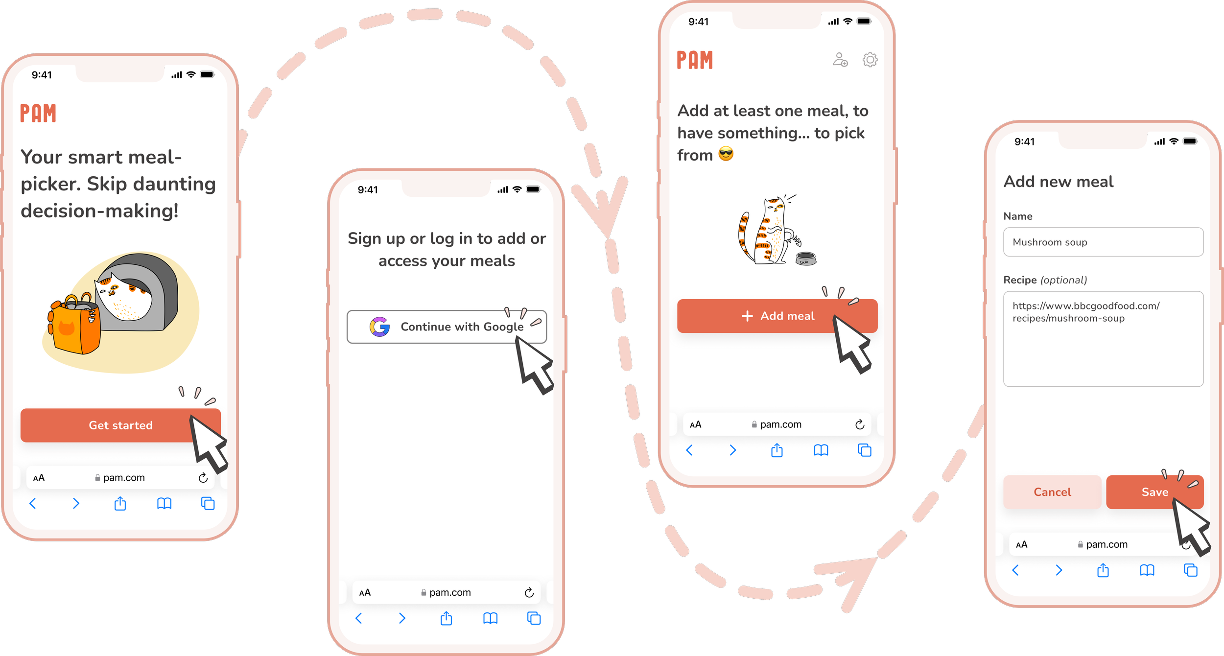
…Create your very own meal list by adding your favorite recipes or simply their names.
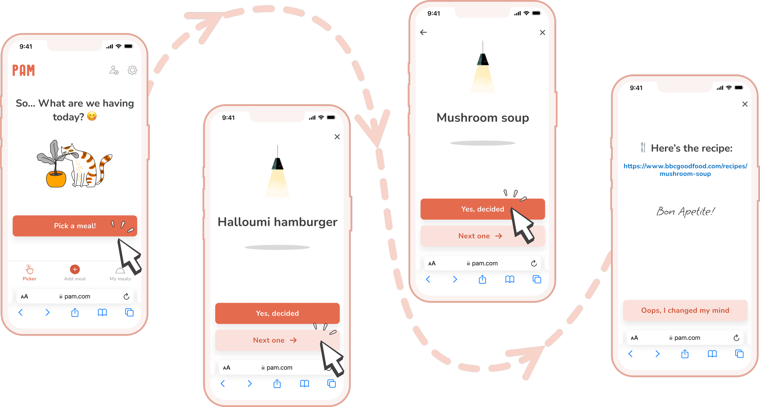
…PAM will suggest meals from your recipe list based on the date you last ate them.
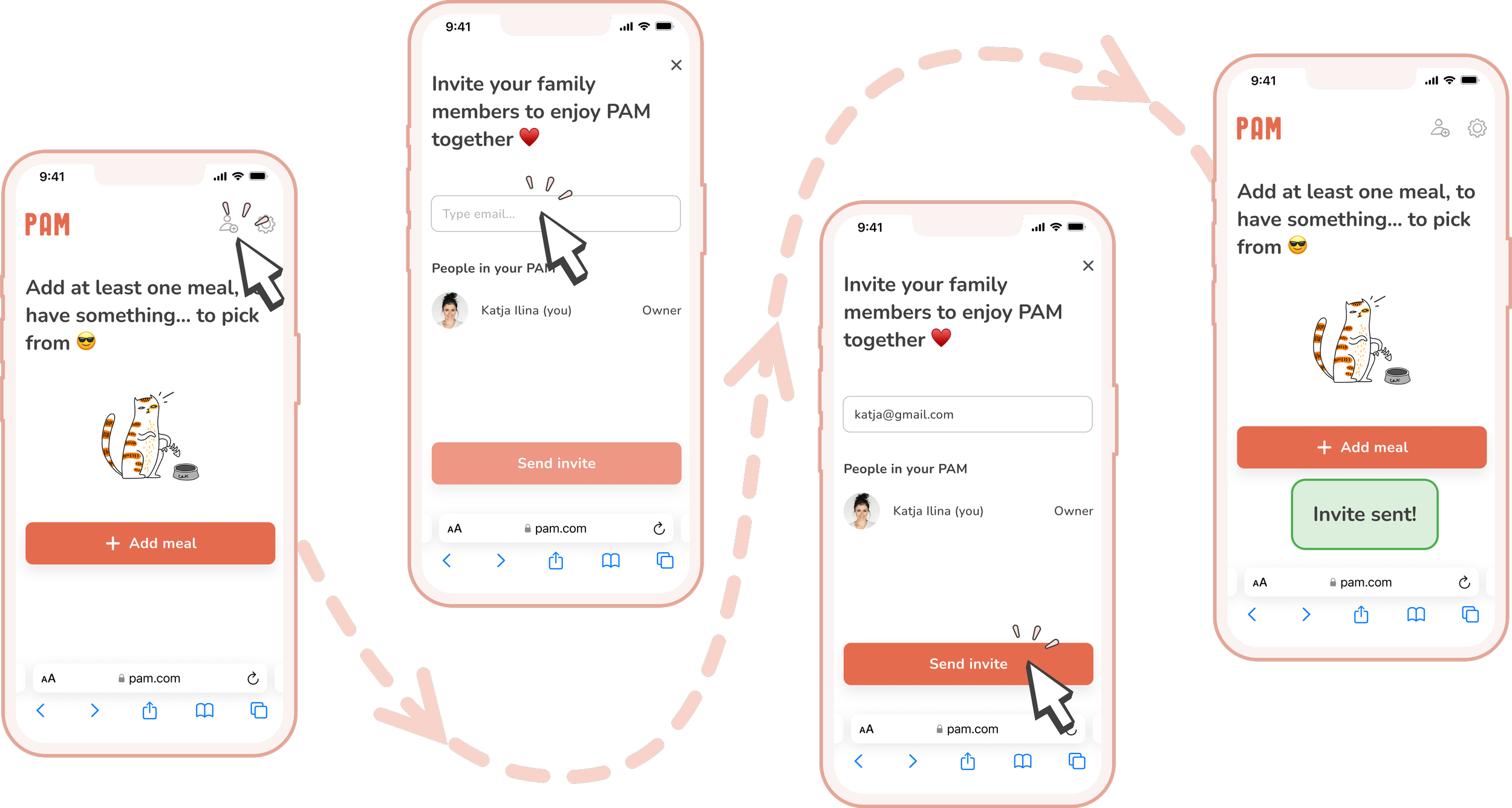
…PAM allows you and your loved ones to share an account, so you can all add, edit, and select your favorite recipes together.
…Store your favorite meals in a simple and easily accessible list. Keep track of when you last ate each meal.
While the simple MVP is being developed, I am already planning a number of additional features that could bring value to the product. These features include: