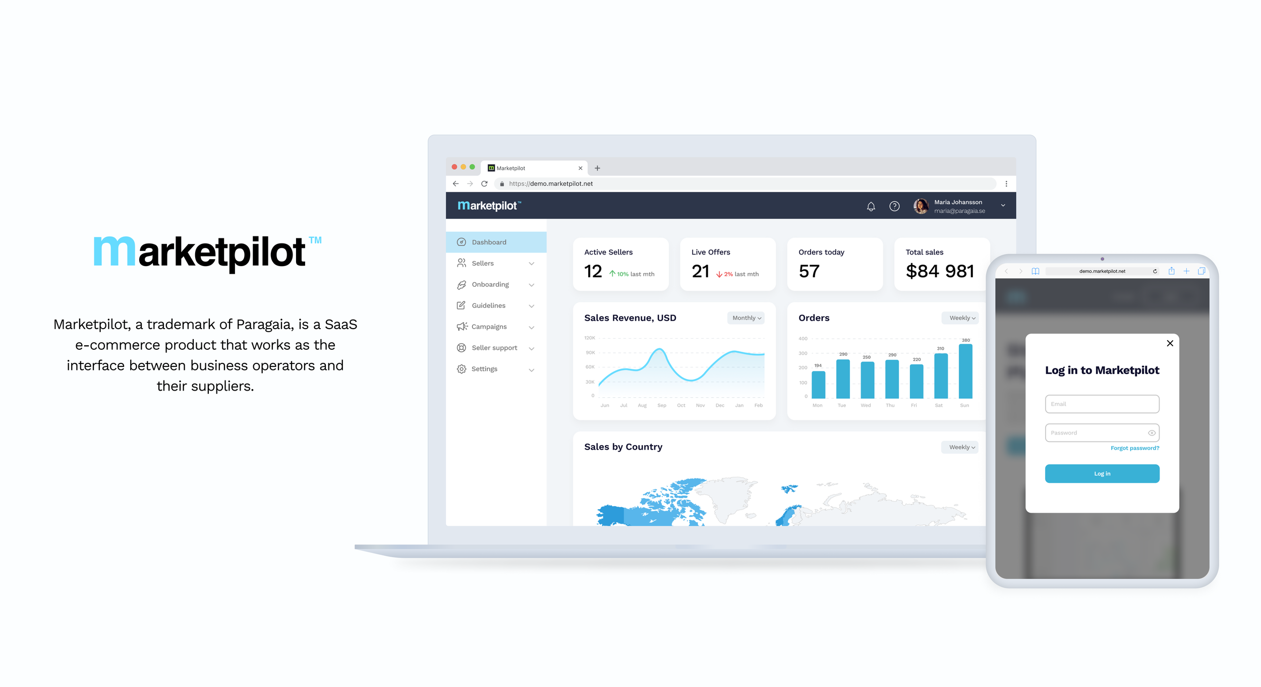
The challenge was to improve the overall user experience for key product features and navigation. The original design was not intuitive to use and was often inconsistent across the platform.
Landing, login and contact pages; campaign flow for both operators and suppliers; onboarding process for suppliers; operator’s dashboard; supplier list and profile pages; navigation menu.
Employer: Paragaia
For each flow that needed to be redesigned, I collected feedback from the team and analyzed it in search of areas in need of improvement. After that I listed all the requirements for the flow in a form of user stories and started sketching ideas while performing competitive research in parallel. Since proper user research could not be performed, I applied general UX/UI practices and took inspiration from the competitive analysis to propose changes in the current design.
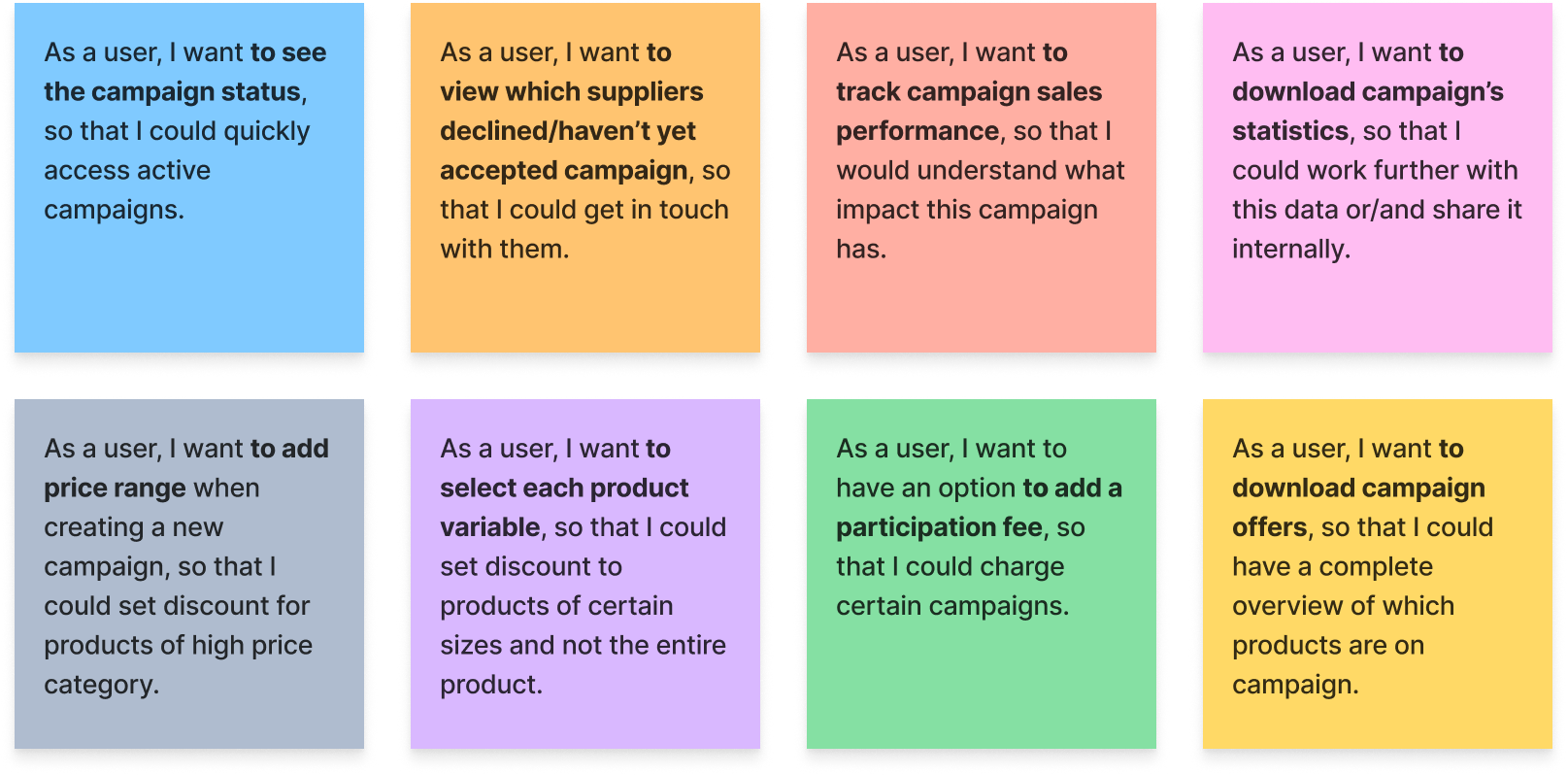
User stories were helpful in gaining a better understanding of key features - why current features were in place, and how new ones would be beneficial for a user. Below is an example of user stories, prepared for the Campaign flow.
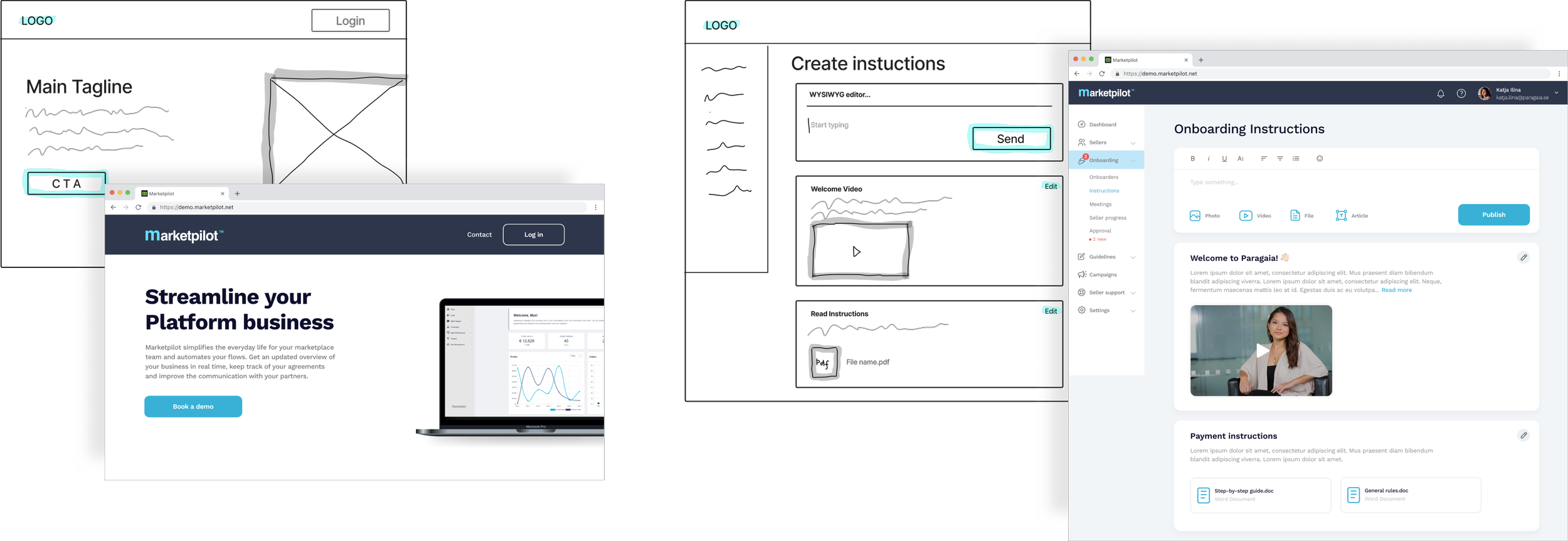
I used paper, and more often Figjam, to sketch the initial ideas. I would often show the mid-fidelity prototype to a team, and after a couple of rounds of discussion I created final mockups for the team’s approval. Below is an example of the Landing page and Onboarding Instructions in their sketch vs. high-fidelity versions.
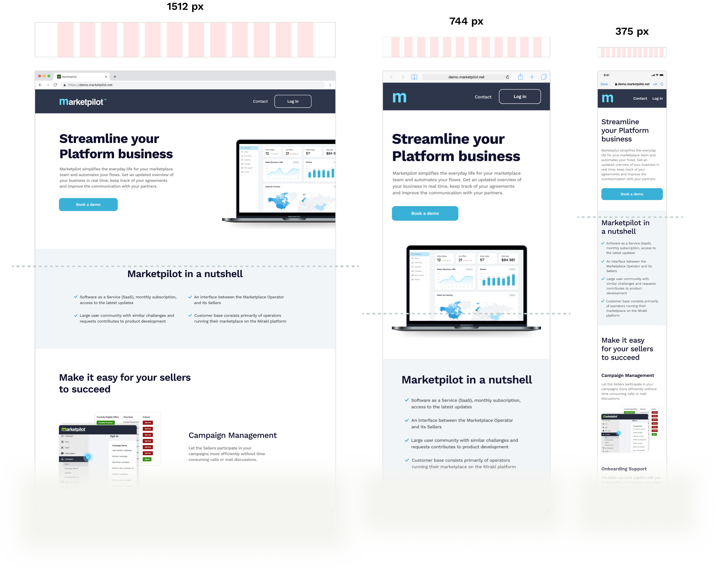
The product itself was initially planned to be used on the desktop only. The landing page, however, was designed to introduce the product to a user and can be read on any device. I made this page responsive by designing for 3 different break points on a 12-column grid.
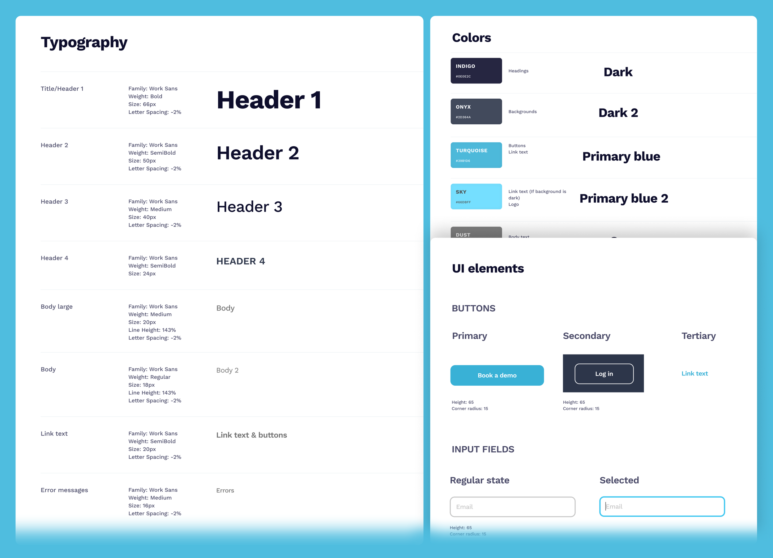
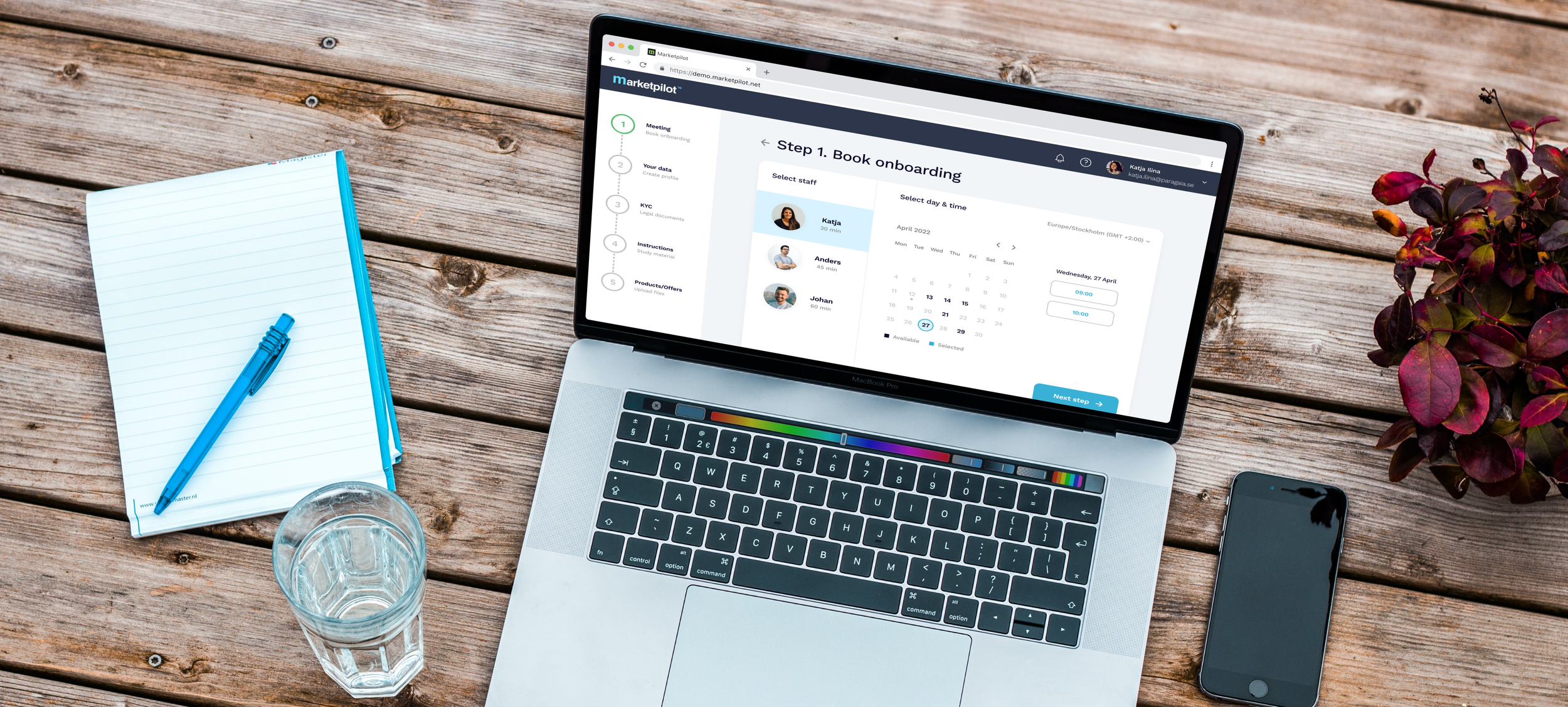
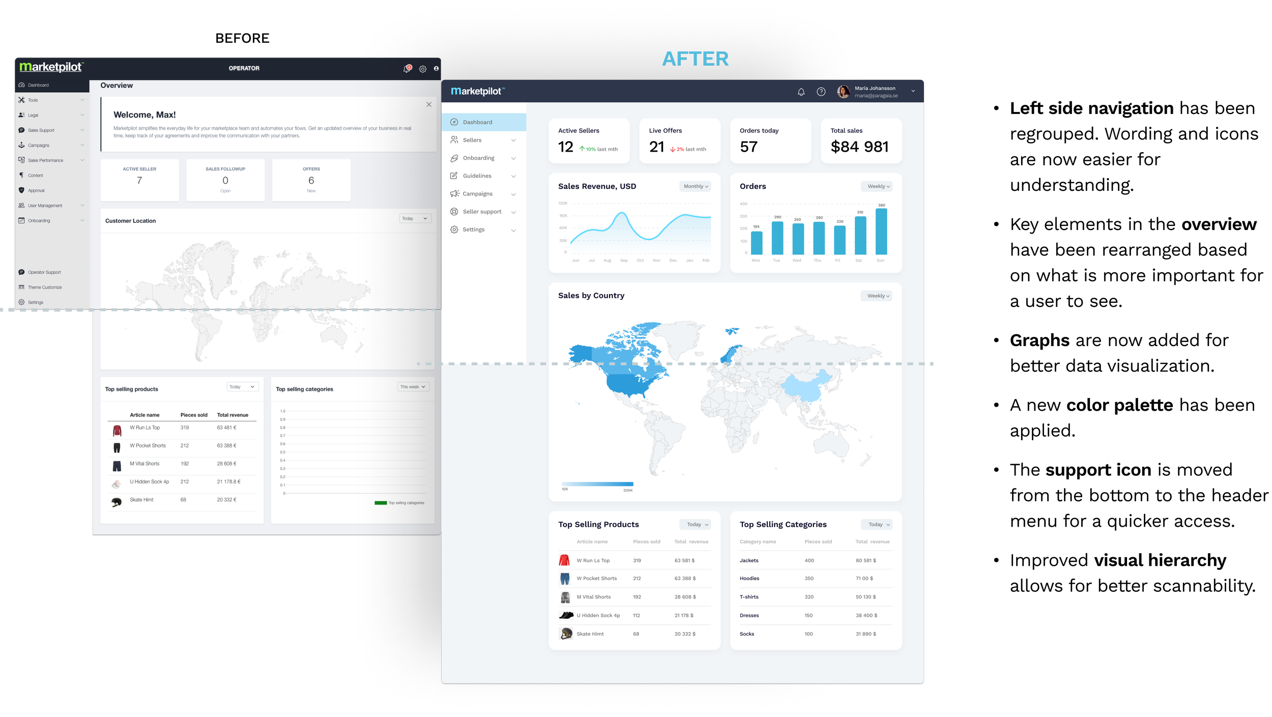
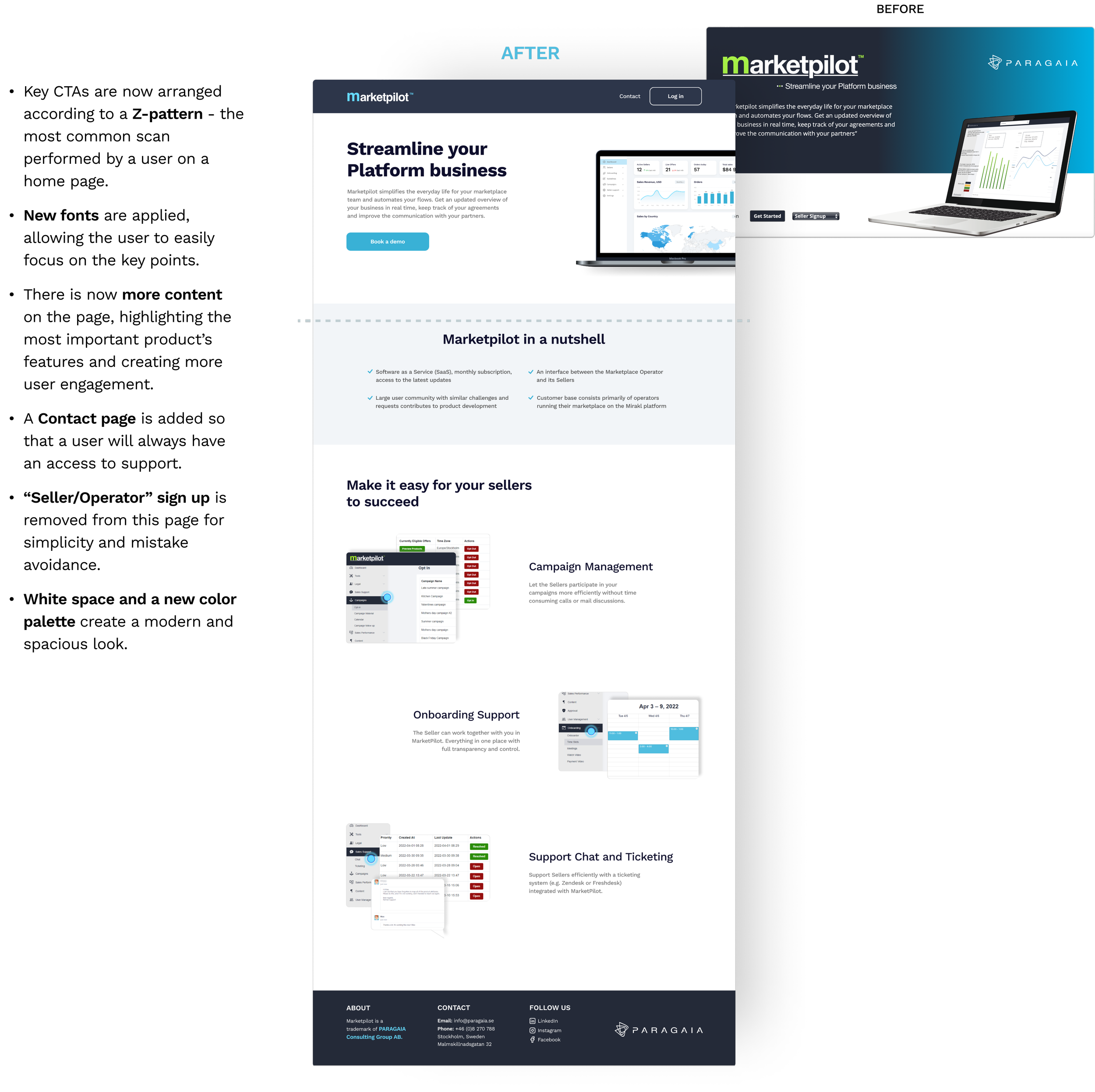
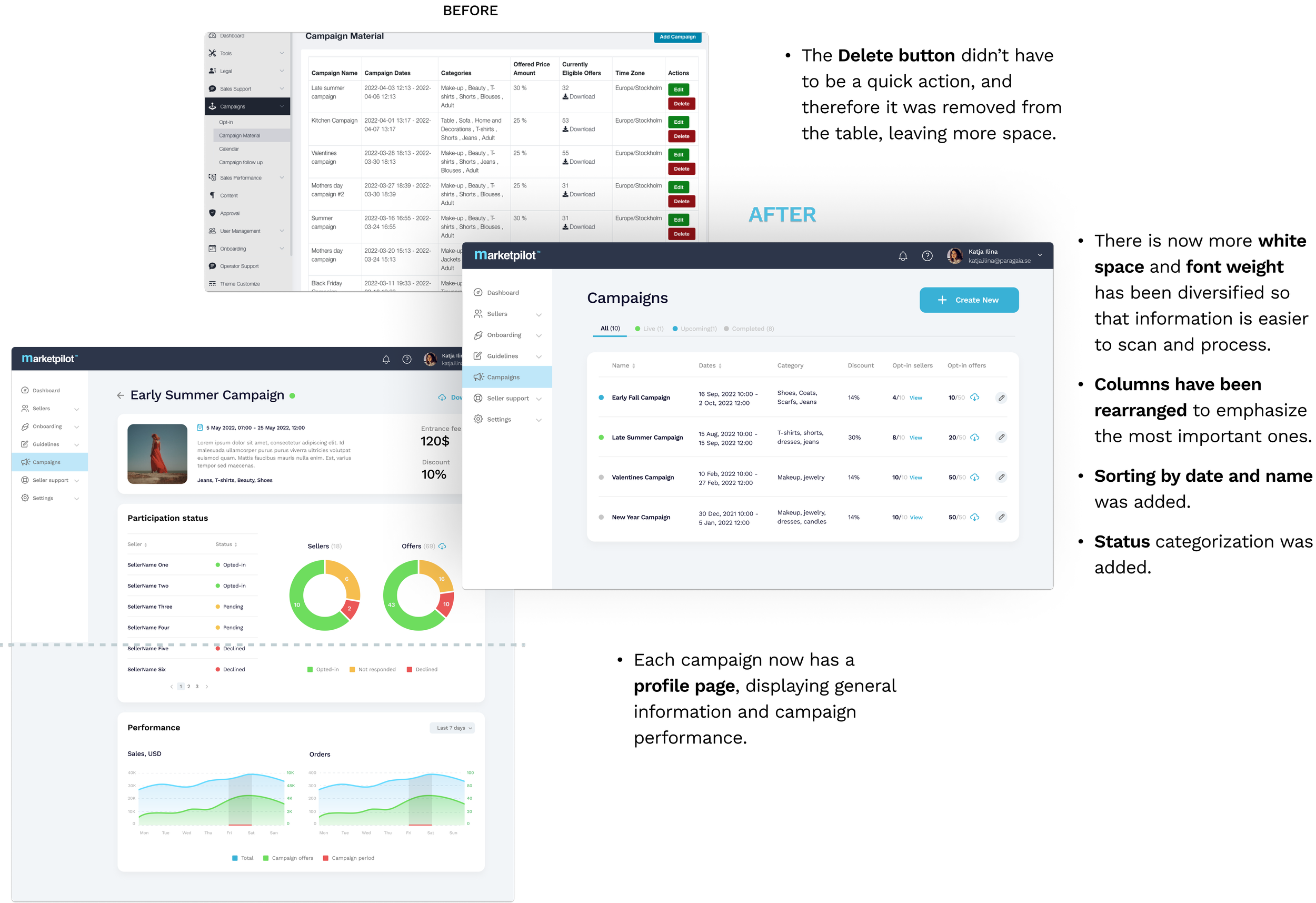
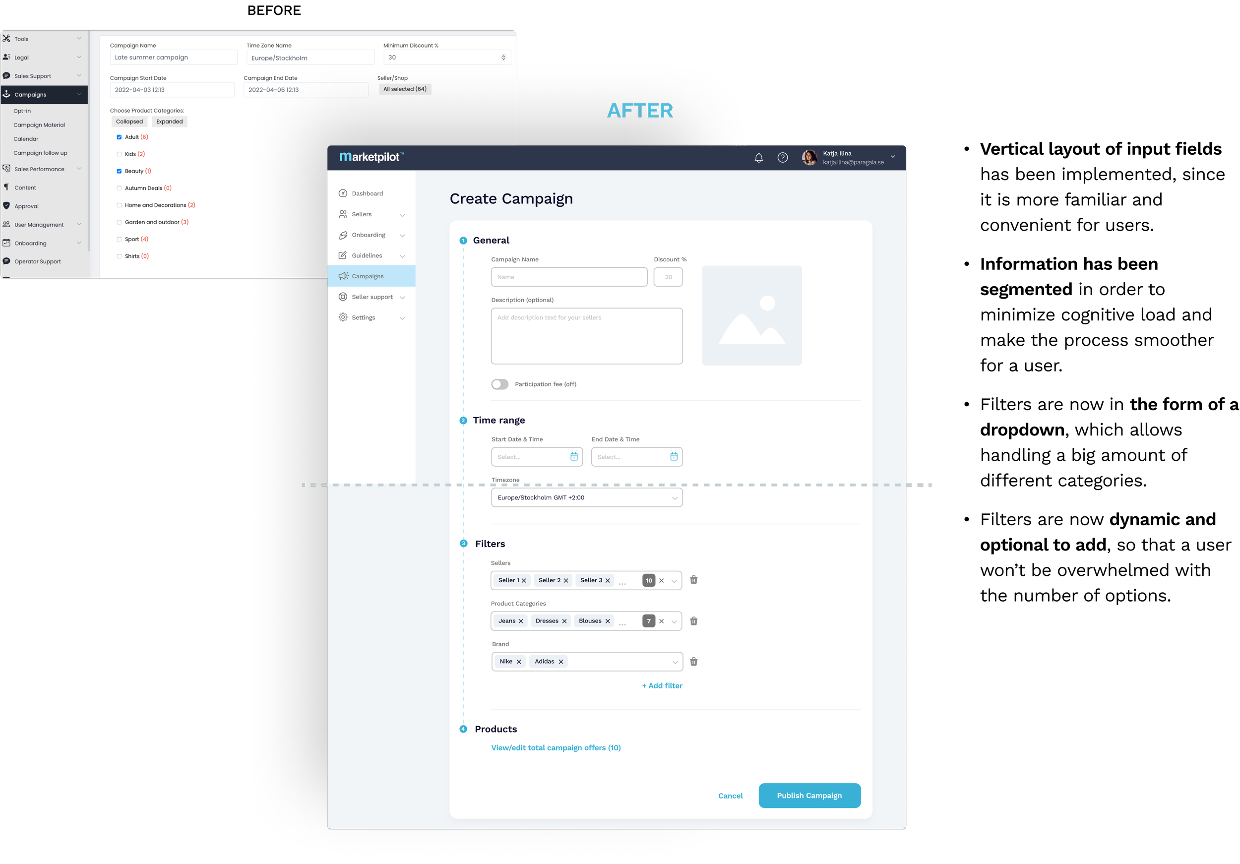
Designing desktop applications is on one hand easier, given the spacious canvas compared to the compact mobile screens, but at the same time more challenging, when considering the amount of different elements and patterns that a web page normally has.
Trying to figure out best practices and the elements’ placement, I would often skip the phase of sharing rapid sketches and would go all in on making alternatives of high-fidelity screens for presentations. It was good in a way that it was easier for a team to view real world scenarios instead of rough drafts, but it sometimes led to situations where more emphasis was put on looks, rather than functionality. A balance is certainly required!