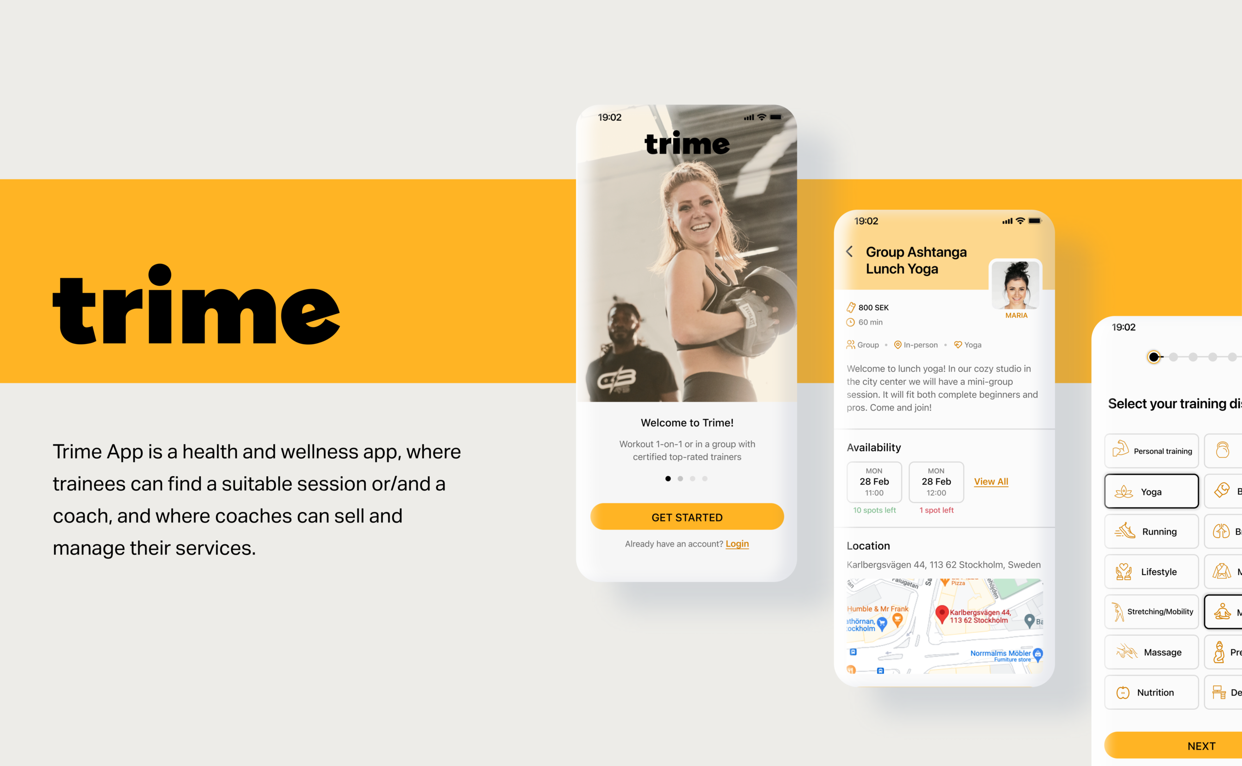
Main user flows of the app lack usability and consistency: some flows are overcomplicated and inefficient, and UI elements are often not in line with common practices. The task was to redesign the core features and to give the app a clean and modern feel and look, while maintaining the original color palette.
Employer: Trime App
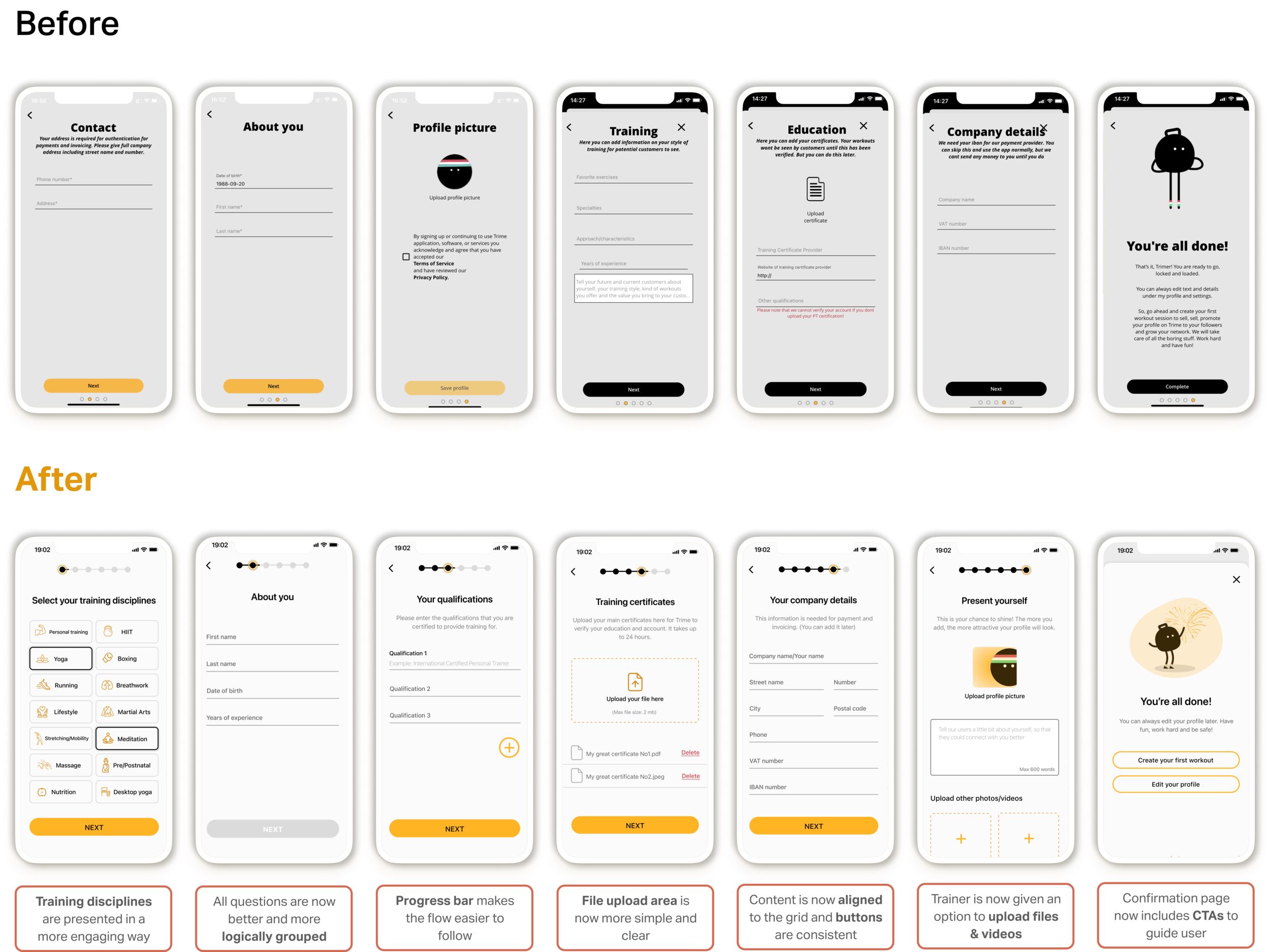
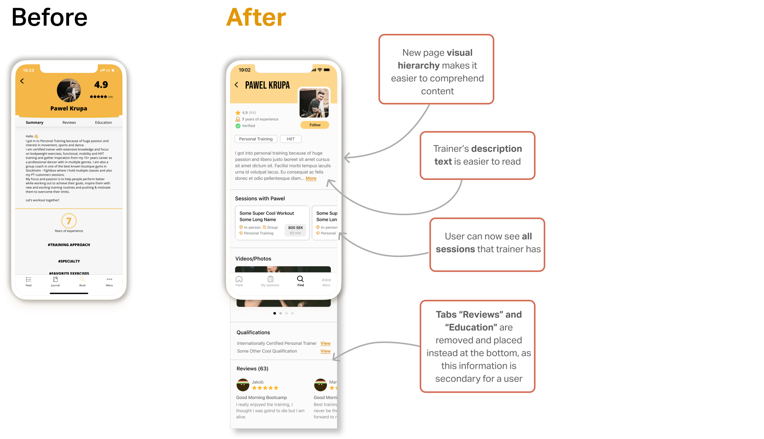
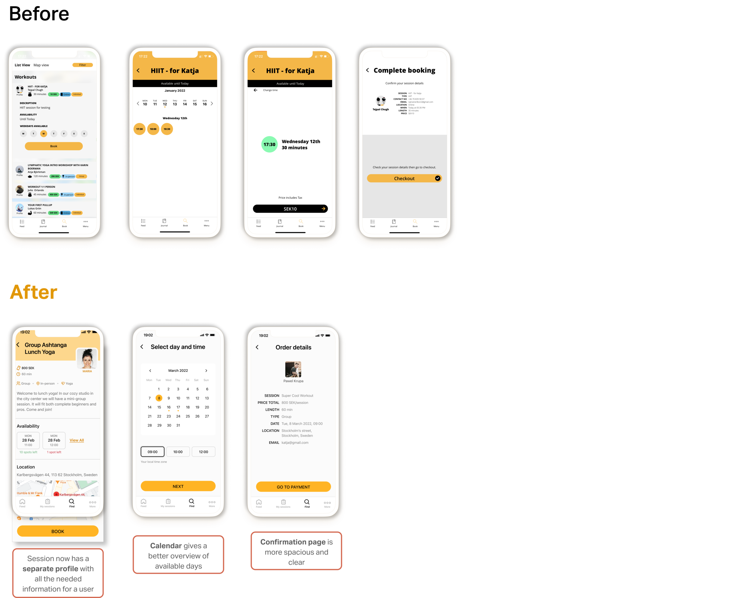
I redesigned the trainee and coach registration process, session booking, session creation, and profiles for coaches and sessions. For each of the flows I applied more or less the same framework: conducted research, analyzed findings, followed by sketching ideas and prototyping, and after testing and iteration, I presented the final designs.

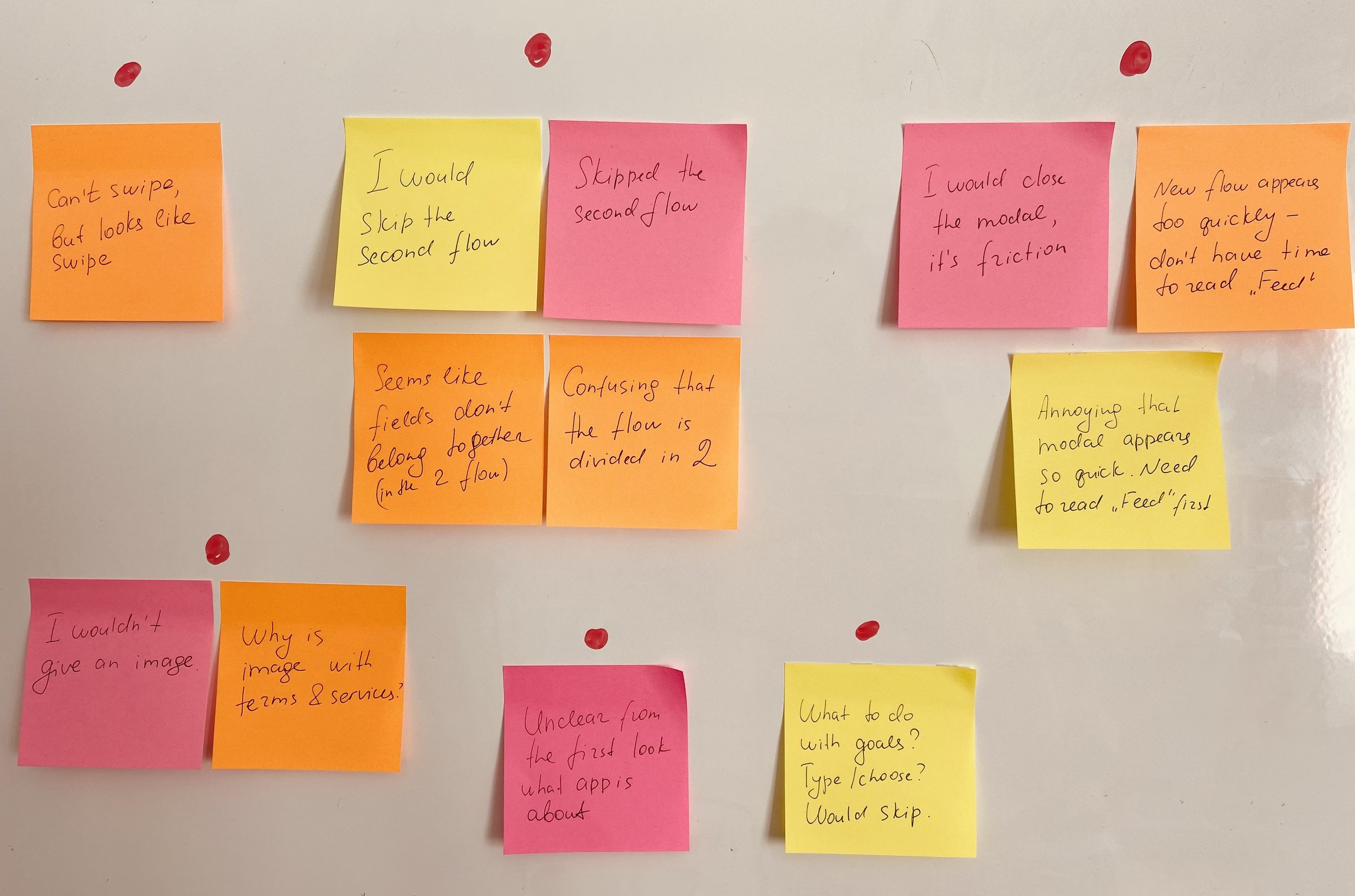
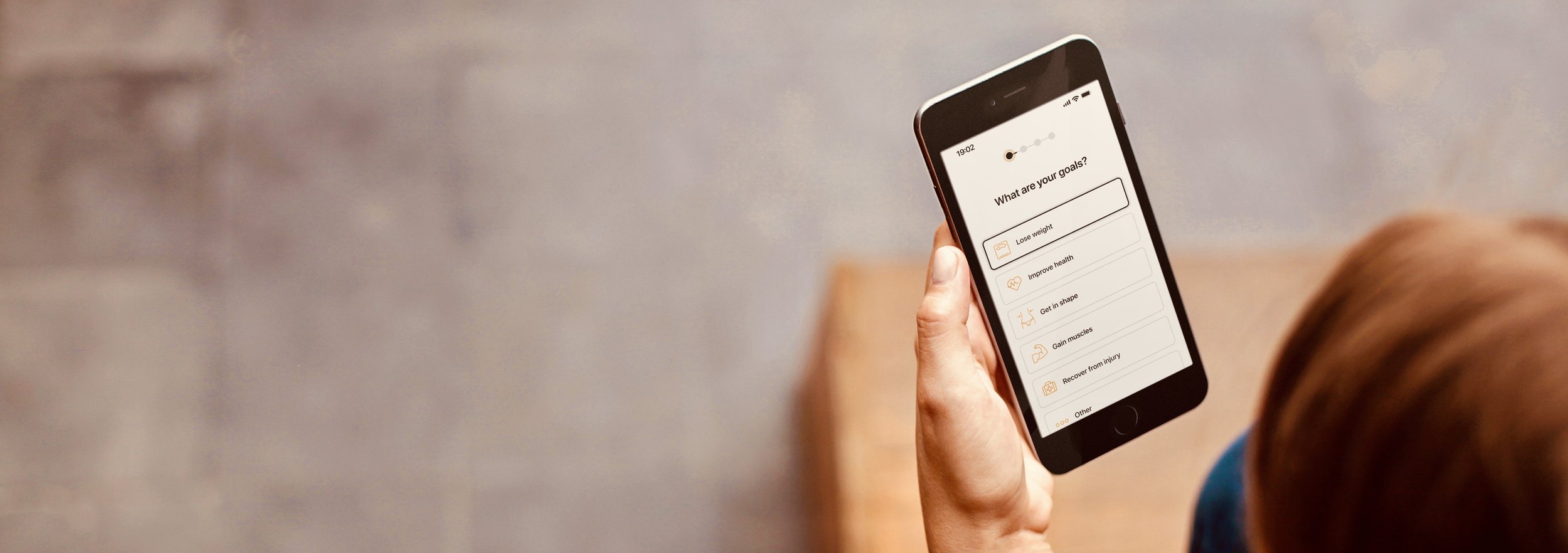
I interviewed several users of the app and then categorized major errors with affinity mapping. Simultaneously I was studying competitive apps to understand how they solve similar problems and to get inspired. Below is an example of the research goals and errors identified in the trainee registration flow.
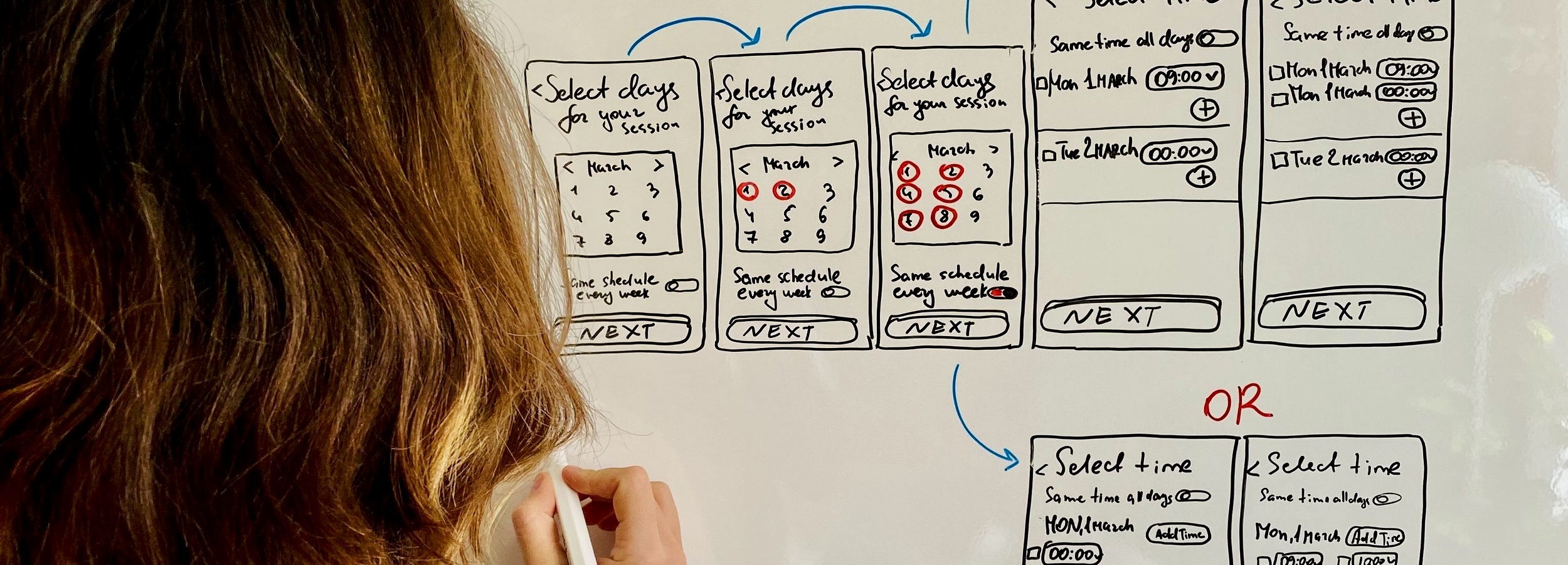
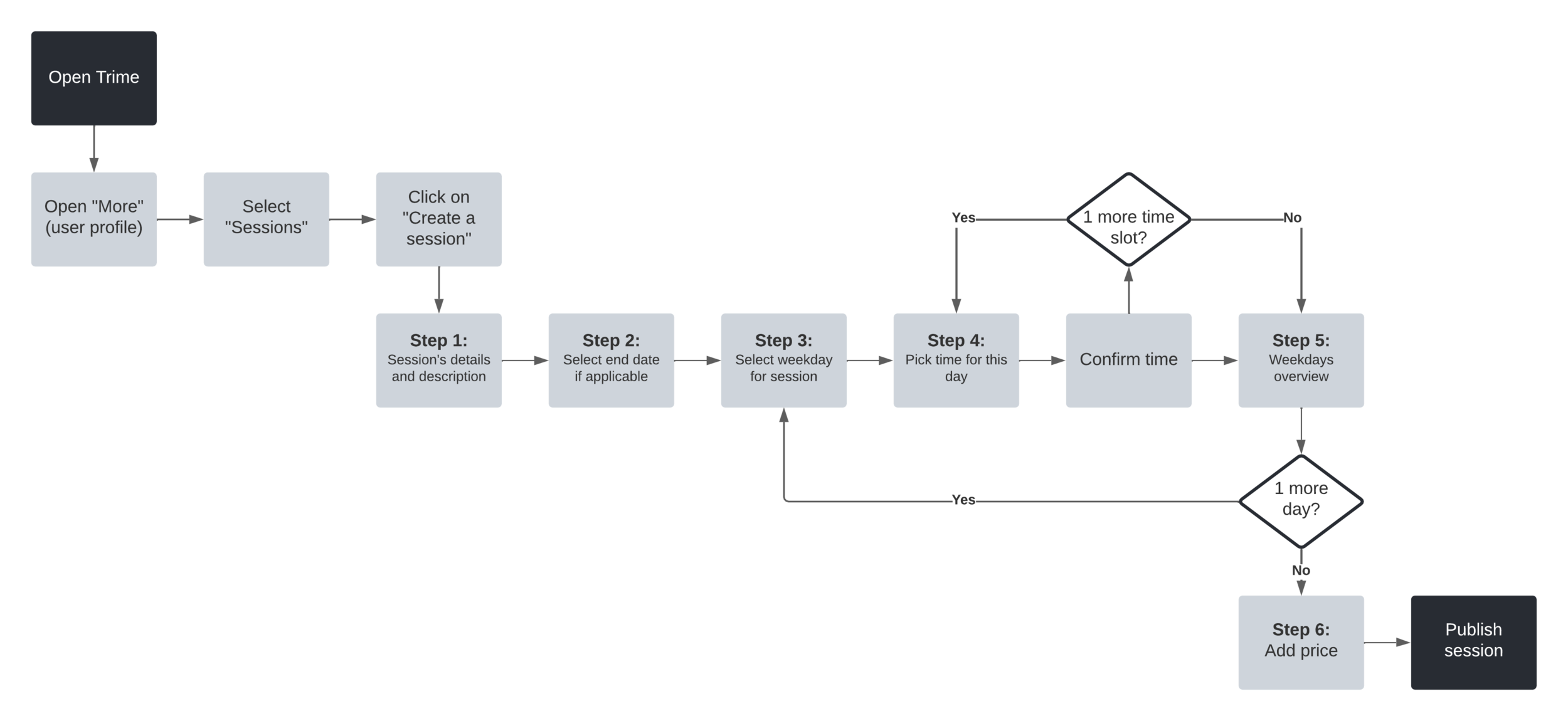
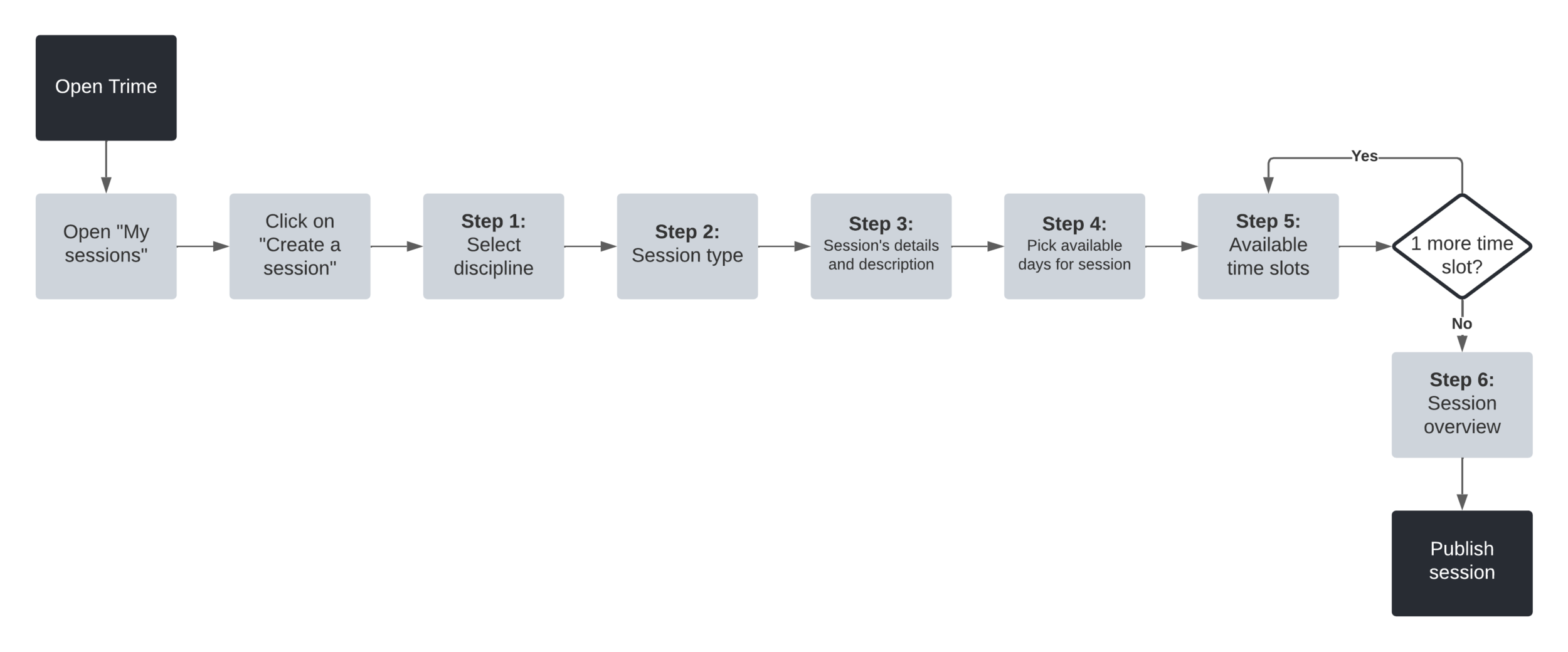
After issues were identified, I brainstormed ideas together with the team to come up with optimized flows. As a result, the registration flow was completely restructured, while the process for creating a session has been shortened and simplified, as demonstrated on the user flow diagram below.
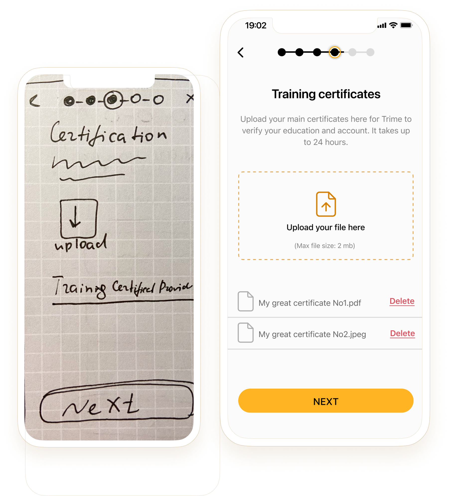
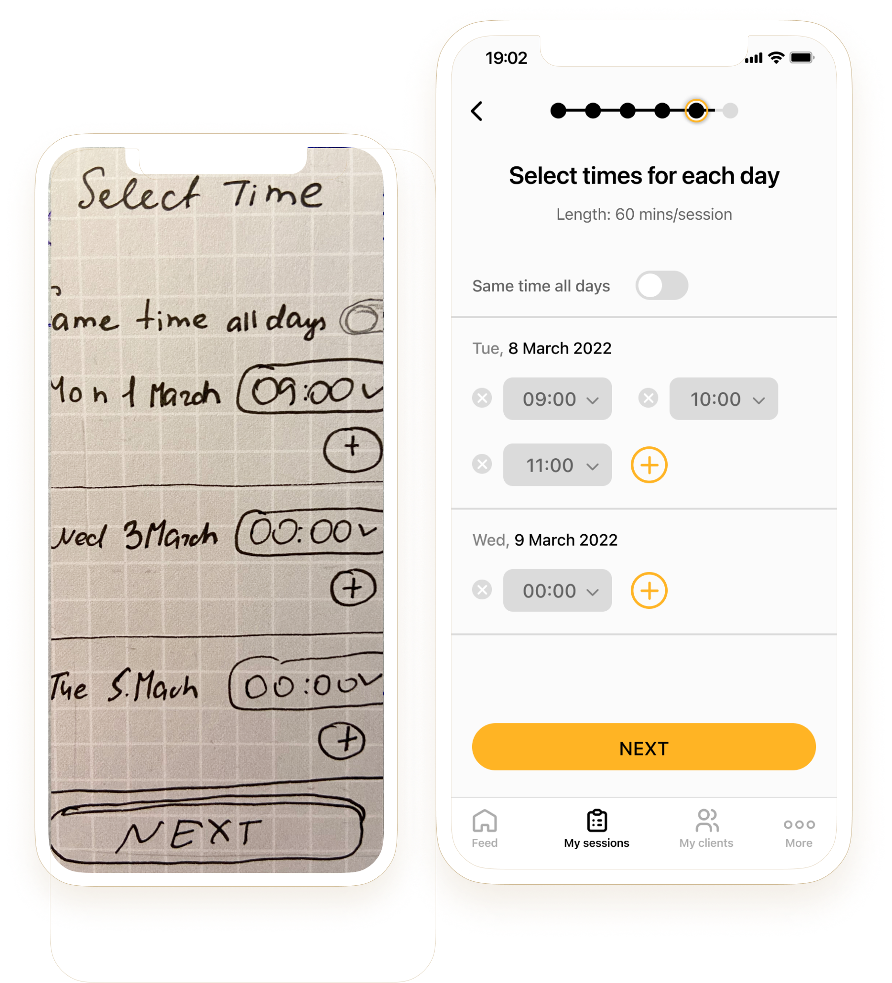
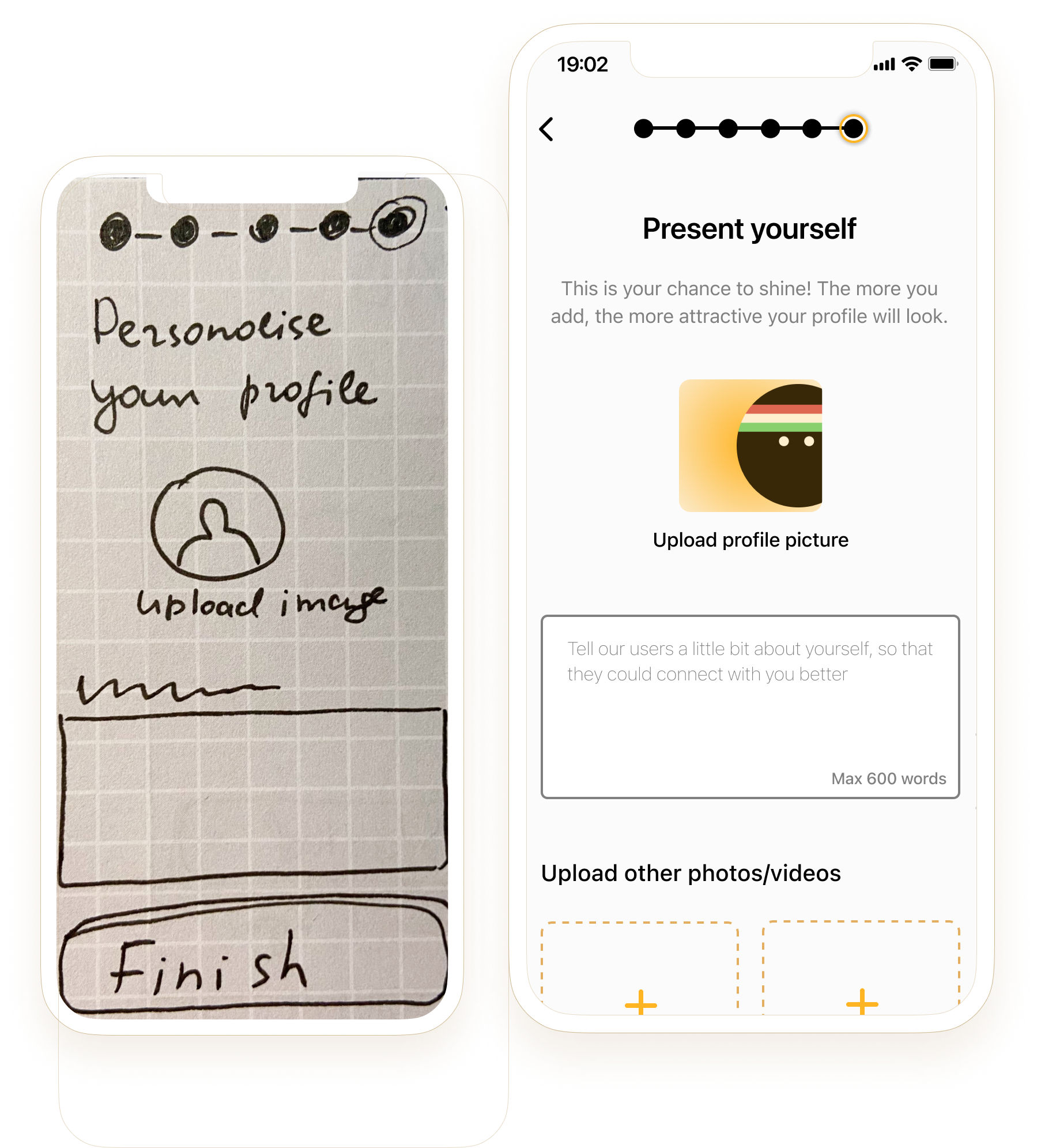
Rapid prototyping on paper and whiteboard was a handy tool. After the team approved the suggested changes presented on sketches, I moved into Figma for mid- and high-fidelity wireframes. Often I would come up with a couple of design alternatives for the same screen for preference testing later on. Below are some examples of paper-to-Figma transformations.
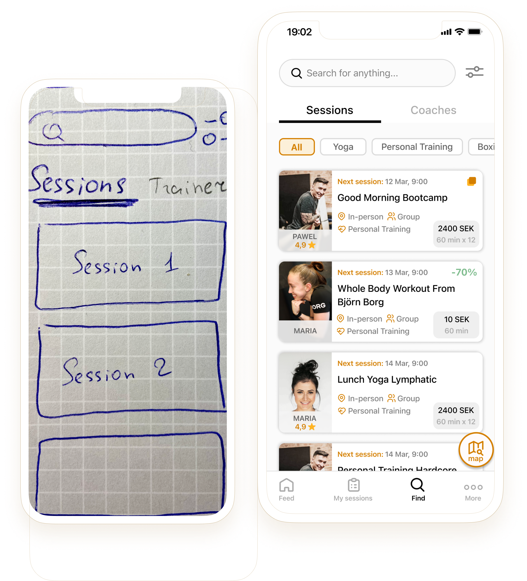
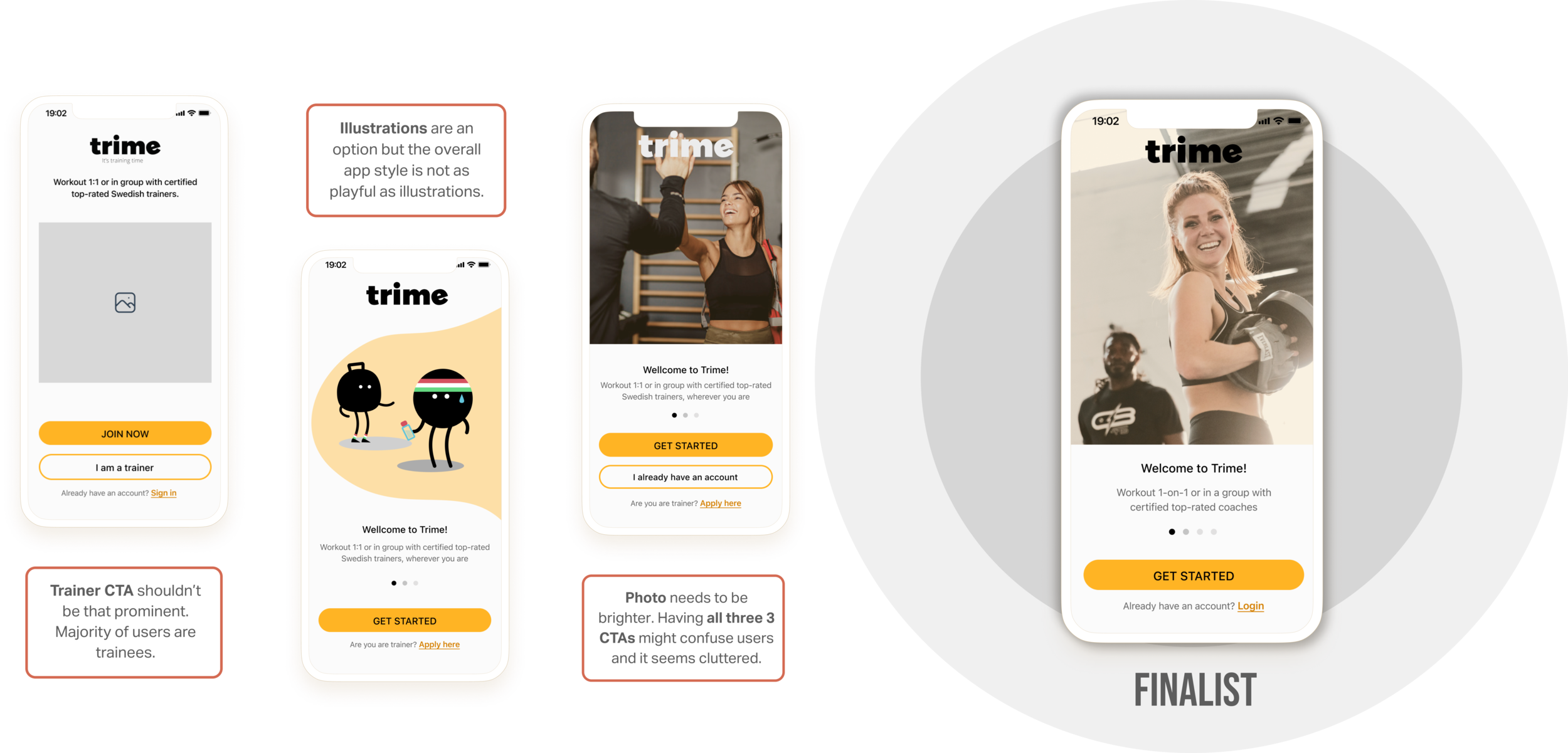
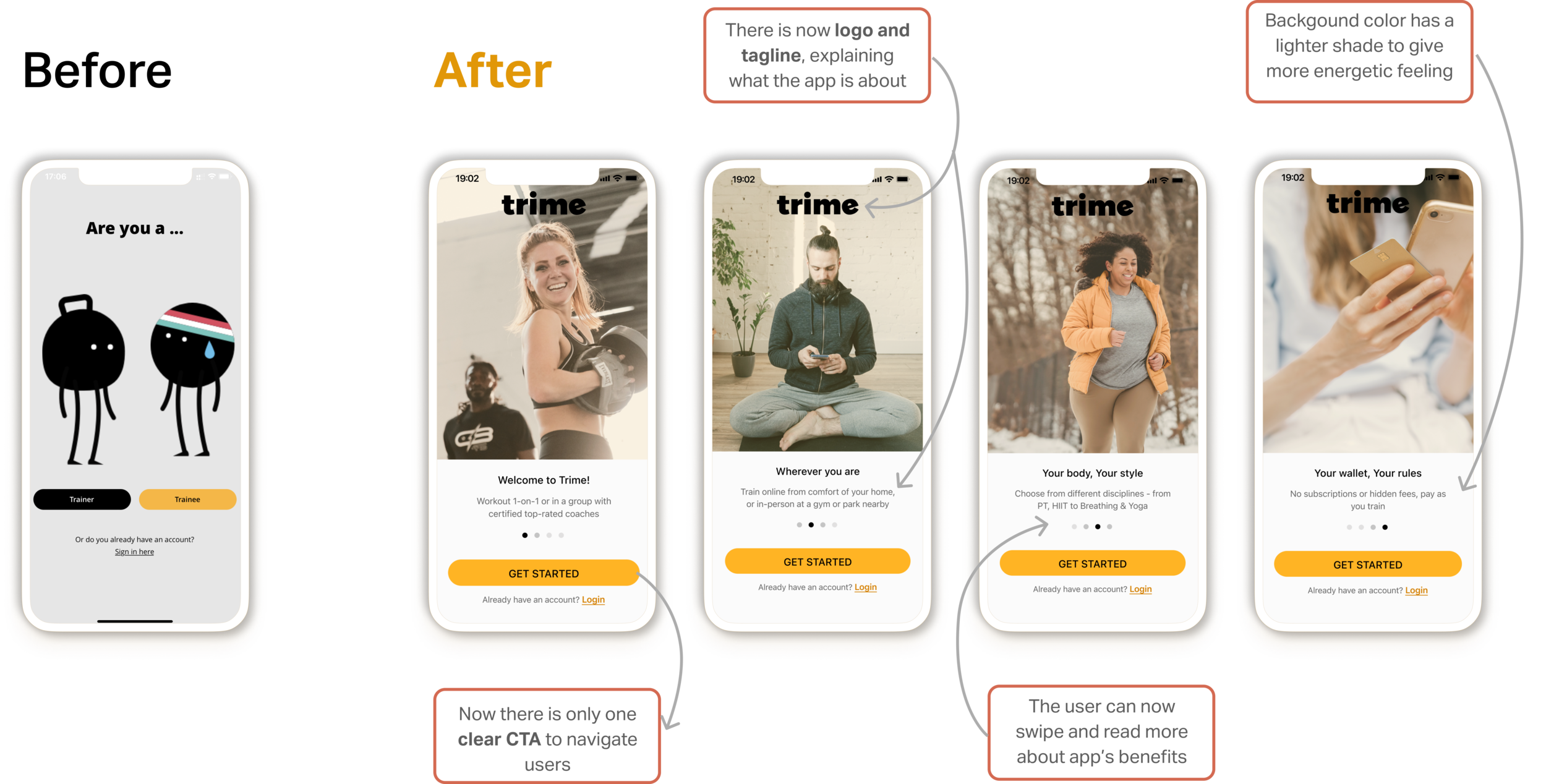
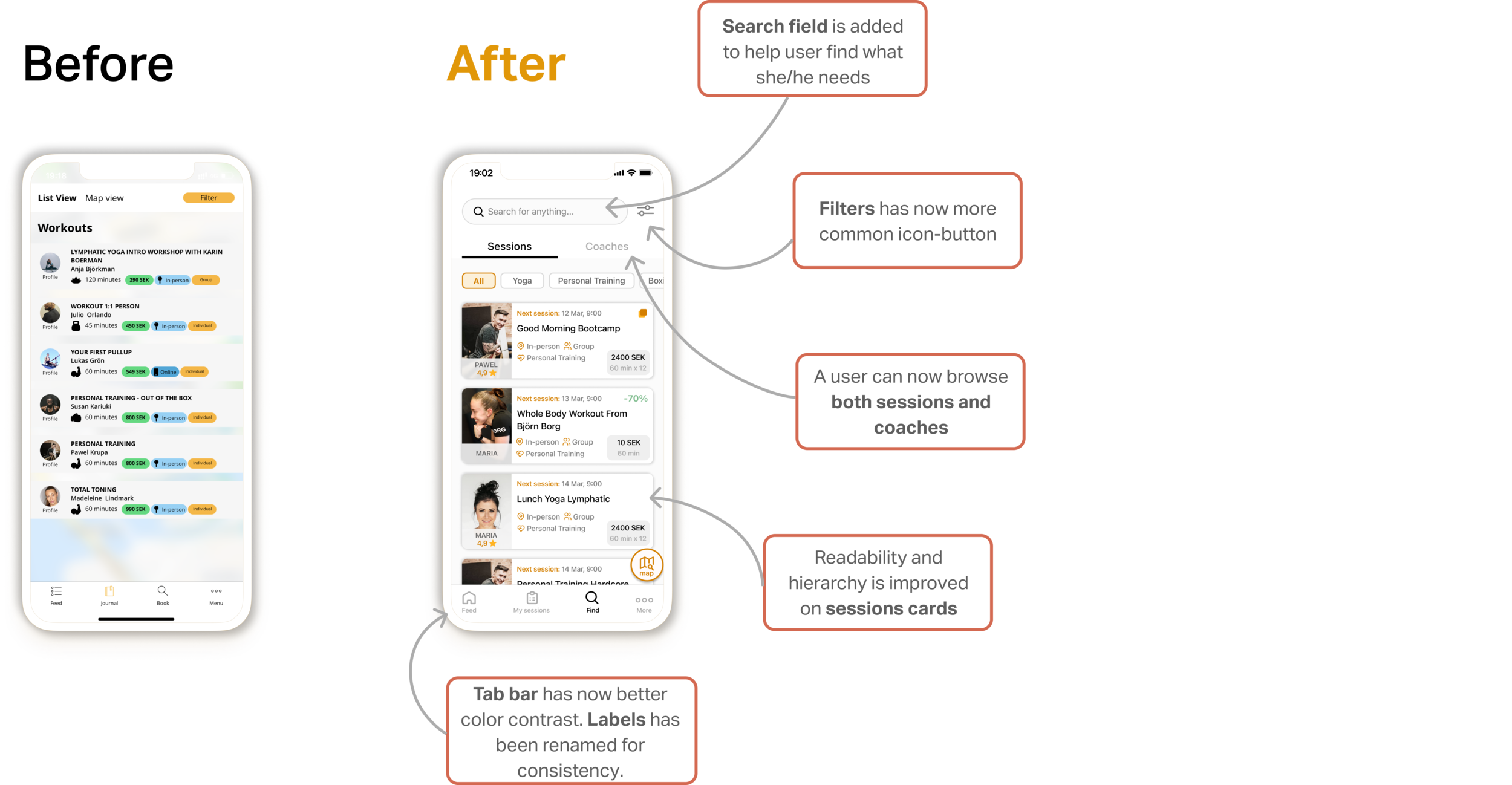
I performed short, often informal, but frequent usability and preference testing sessions in order to catch flaws at early stages. Below is an example of the evolution of landing page and session cards after testing and multiple iterations.

The app has a lot of functionality, therefore to do a complete redesign in such short time and with limited resources is by all means challenging. It was important to find a balance, where quality would not get affected by the quantity of work. However, given the constraints, it was not possible to perform UX design by-the-book so to speak. For example, proper user research was not prioritized in the project as the main focus was placed on correcting a number of significant UX and UI flaws of the original app - which was fun, to be honest, as well as great practice to sharpen skills as an interaction designer.